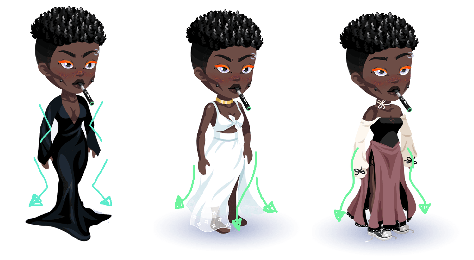
Shape & Silhouette
Why is considering the shape of an item an important part of the concept process?
Highrise is viewed mostly from a phone screen, so the items end up being much smaller than they look on our computers or drawing tablets. Making sure most details can read from afar will help your item's aesthetic!
Some silhouettes have more impactful visual appeal than others. Try to exaggerate the shapes of items in ways where it feels more dynamic while remaining believable.
Pushing Avatar Proportions and Item Shapes
The proportions of the avatar may seem limiting, but there’s no reason to follow the exact shape of the avatar. Have fun with it and exaggerate proportions for a more interesting look!
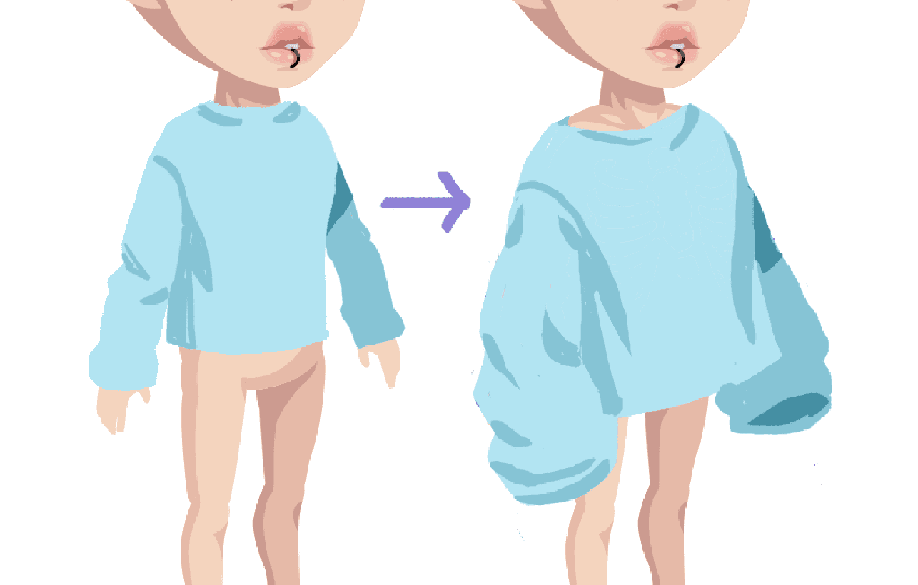
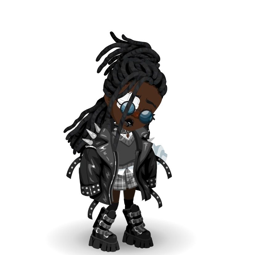
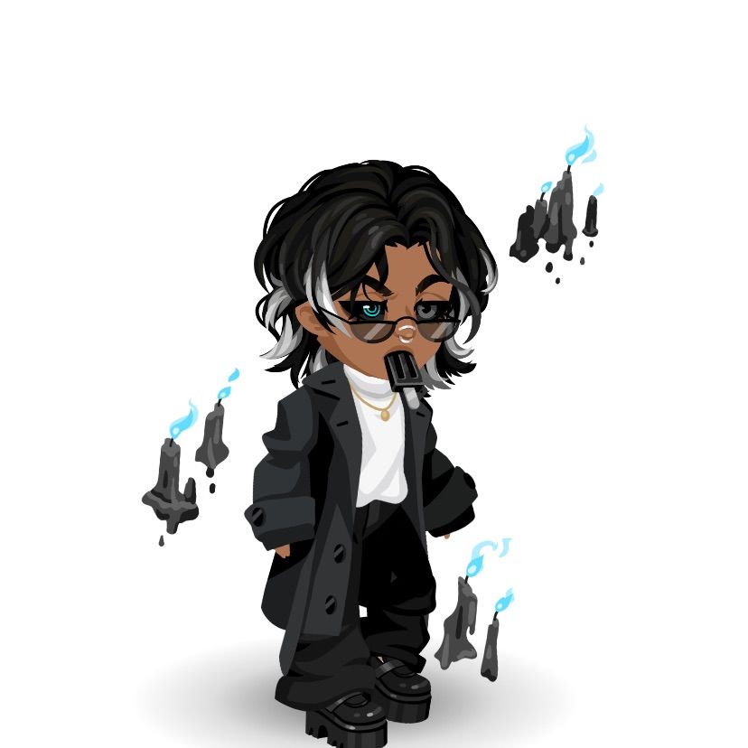
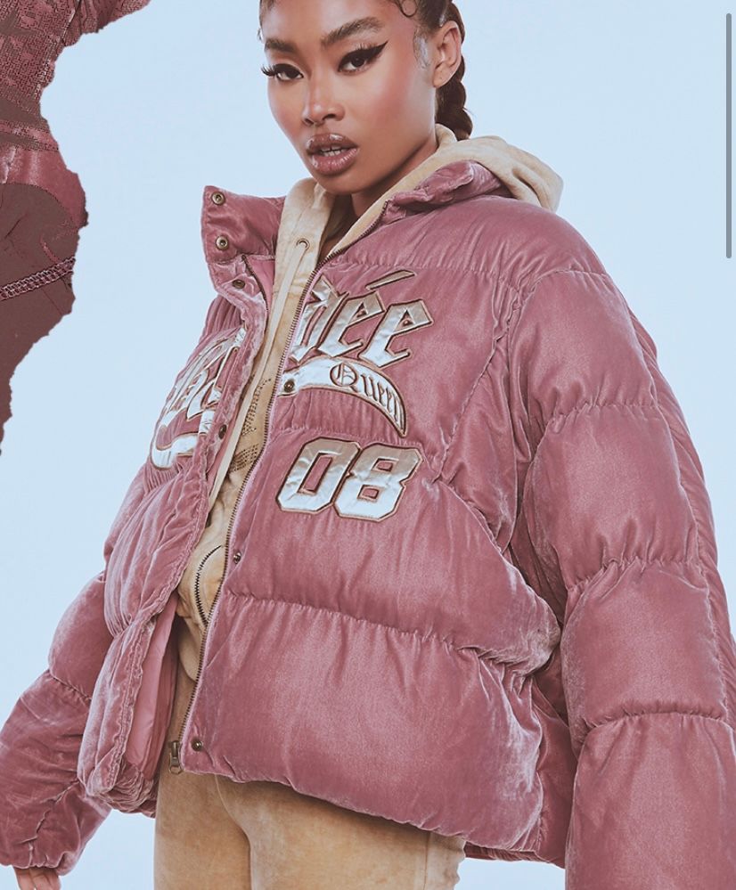
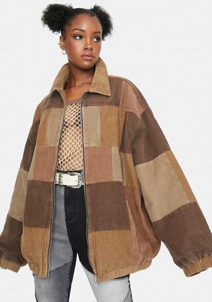
Folks tend to gravitate towards oversized items. Off-shoulder details can make an item more dynamic as well.
Some examples of items that don’t follow avatar proportions too closely:
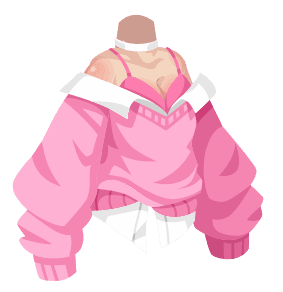
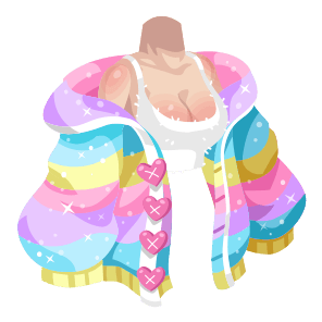
A mix of tight and oversized items gives some visual appeal.
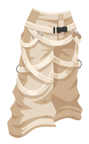
This same rule still applies to tight clothing. Adding onto the anatomy by adjusting the shape of the clothing will make the avatar more appealing and believable.
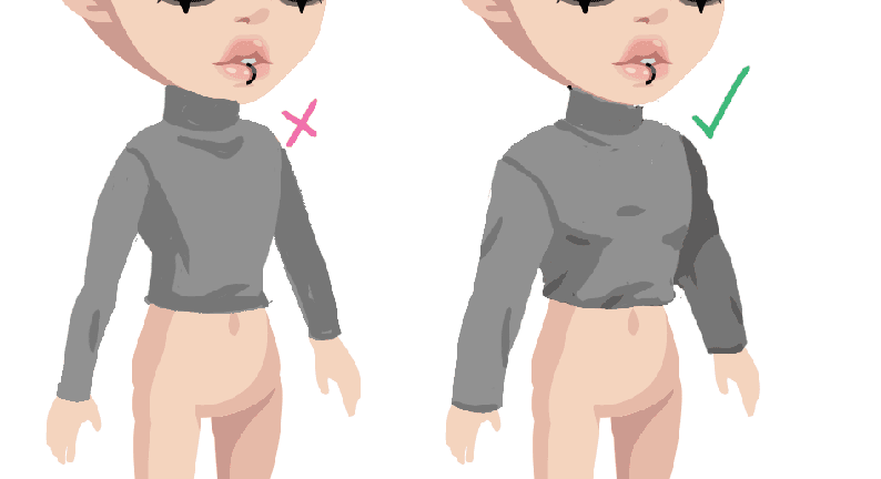
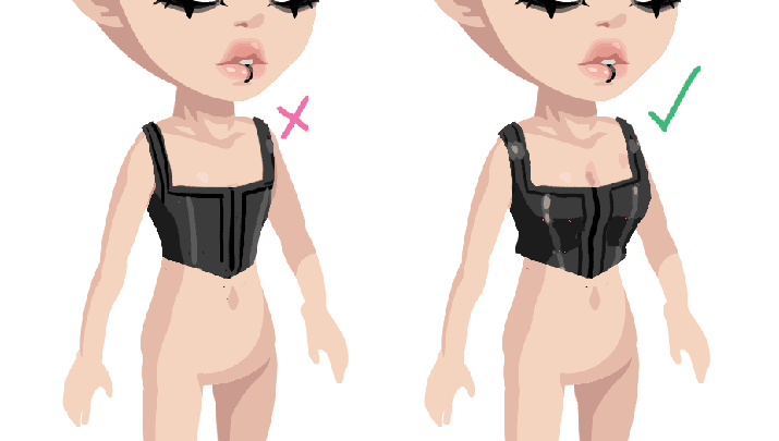
Some addition of realistic anatomy gives the avatar some more personality.
Hiding body parts and creating new ones
Don't be afraid to go bold! We can push the shape of the avatar body more drastically by hiding body parts in our Admin Panel and drawing a new base body - we do this to push proportions or to create certain body types.
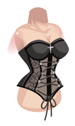
Here, the core is hidden to create a snatched waist effect.
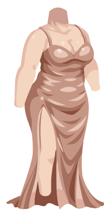
Almost the entire body is hidden to create a thicker body type.
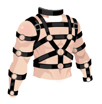
The core is hidden to create a realistic male torso with muscles.
Creating interesting shapes with hair
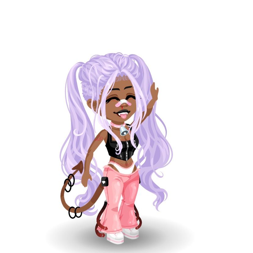
Hair shape and flow is important because it frames the avatar’s face and body. If a hair is too stiff or awkwardly shaped, it can throw off the look and personality of the avatar.
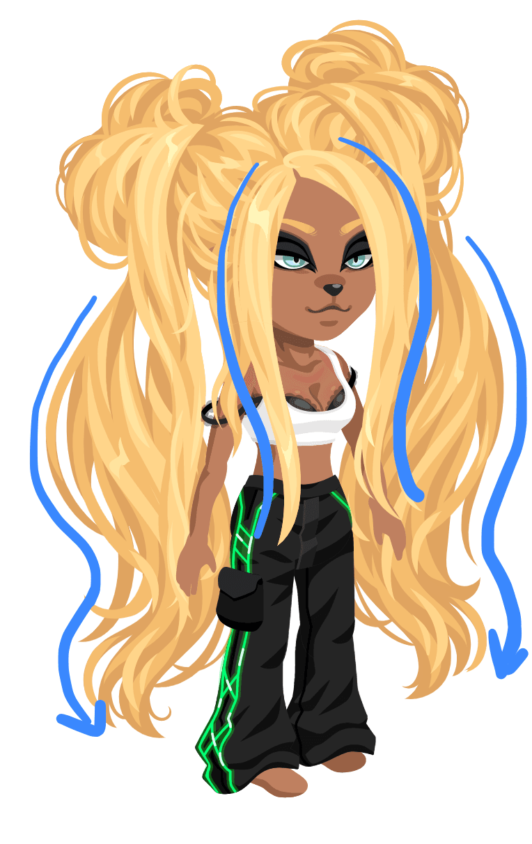
The flow and balance of this hair automatically gives this avatar personality and movement.
Bigger pigtails makes a more interesting silhouette.
These rules apply to short hairs too - shape is especially important so keep them visually appealing.
Some real life examples of playful shapes and silhouettes:
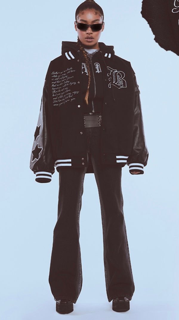
How do I translate something from a reference into our style?
Try to think of a reference and mood board as style inspiration rather than trying to copy the exact reference.
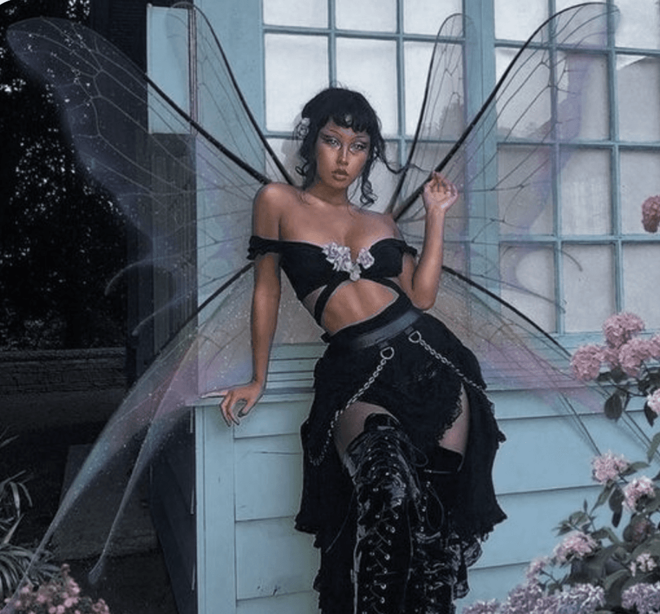
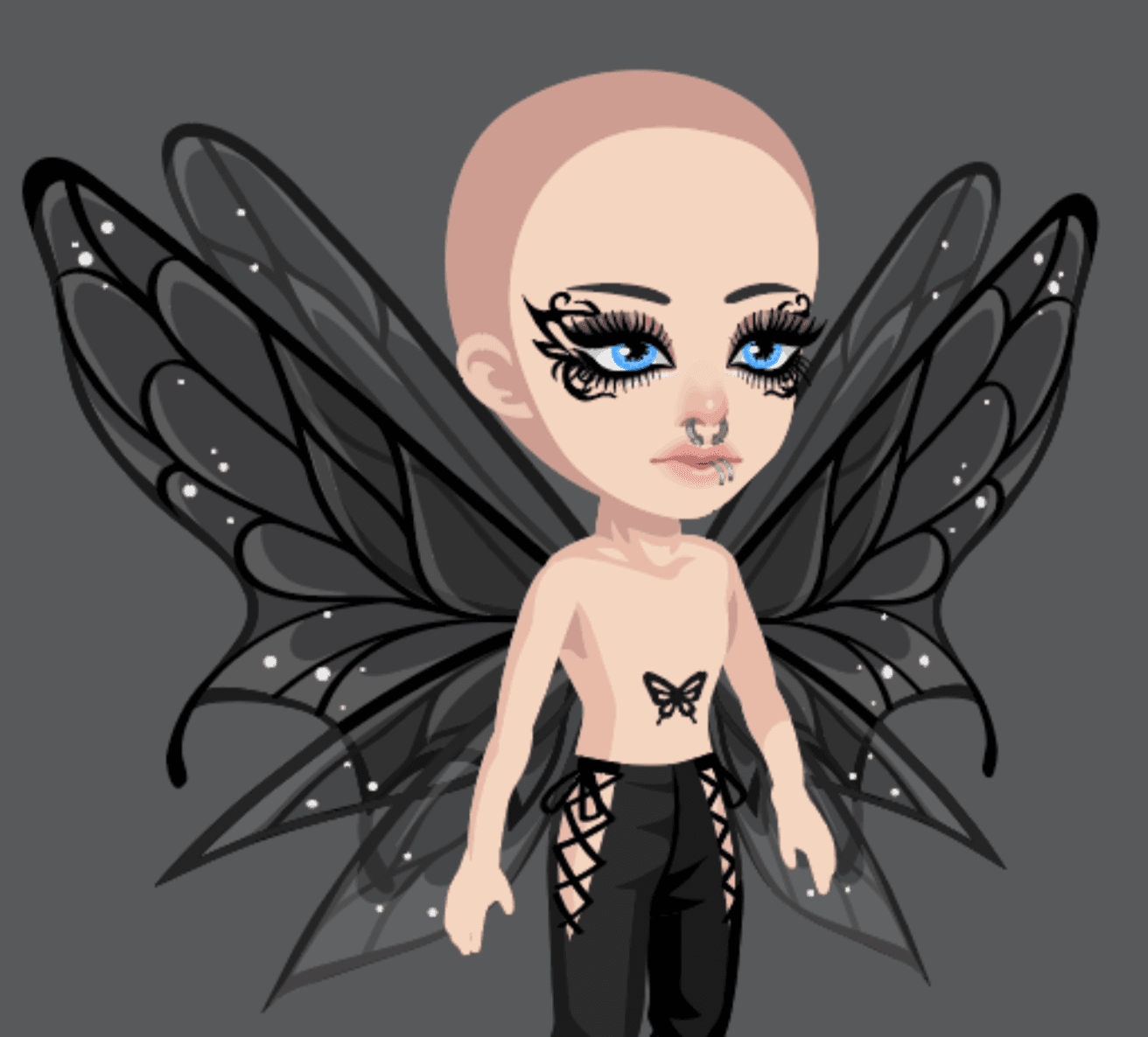
The wings aren’t very clear, but the theme is “goth fairy” so you can take the general idea and run with it.
Dynamic Flow
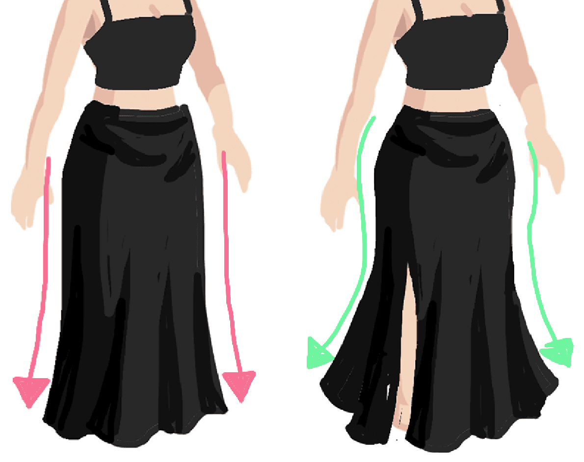
A maxi skirt like the left image feels a little too stiff and uninteresting. Try adding some more interesting shape and flow (right image) to make the avatar more dynamic
Some examples of items with dynamic flow:
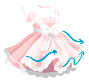
The flow of the folds in this dress creates an illusion of movement.
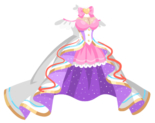
This dress is from a magical girl event, so the addition of flow is very appropriate for the theme.
Here are a few different examples of ways you can interpret a maxi-length skirt or dress. Add some flow and fun shape to it to increase appeal!
