Drawing & Designing
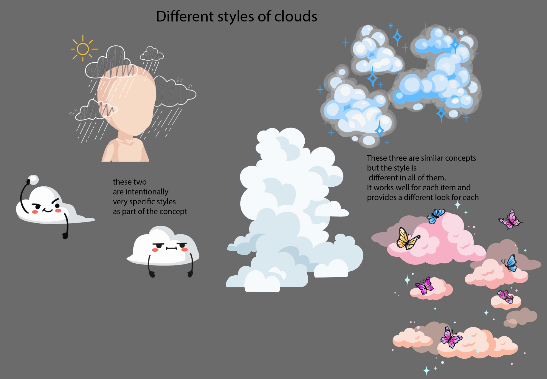
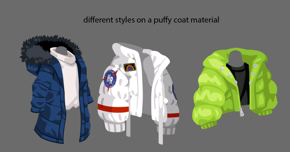
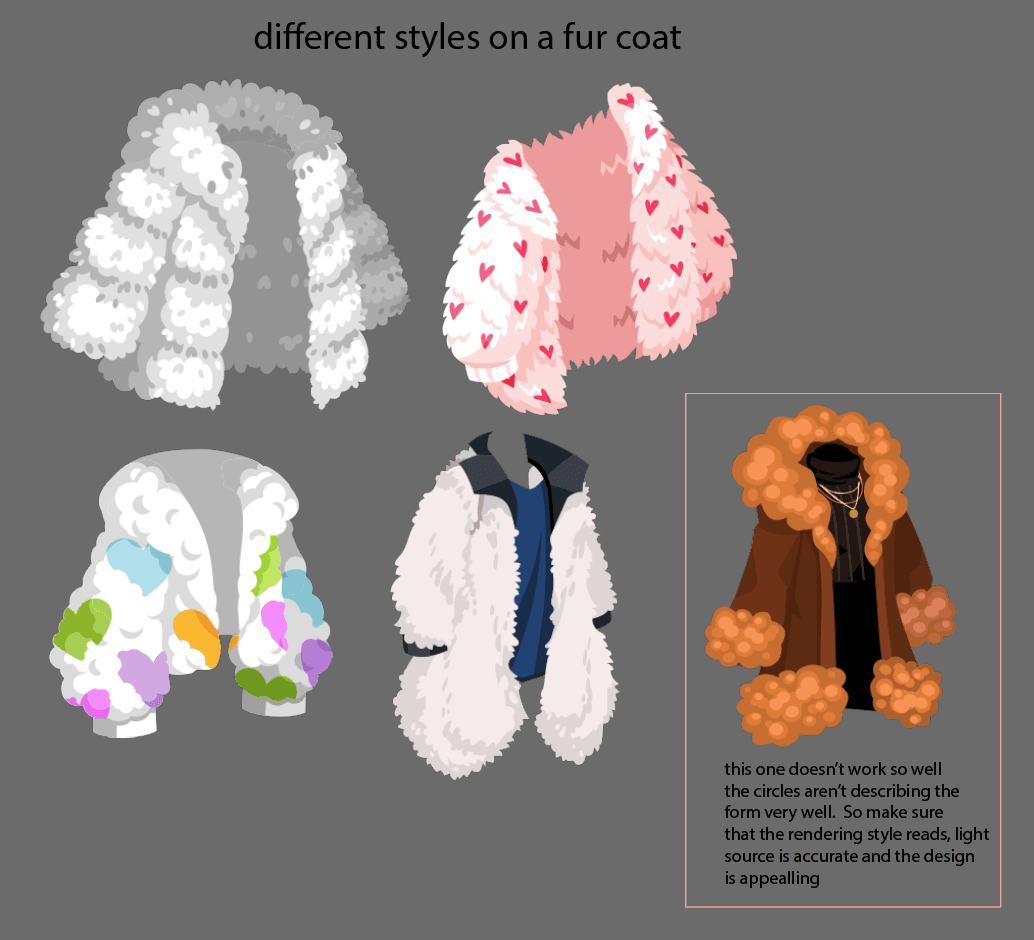
Style variation
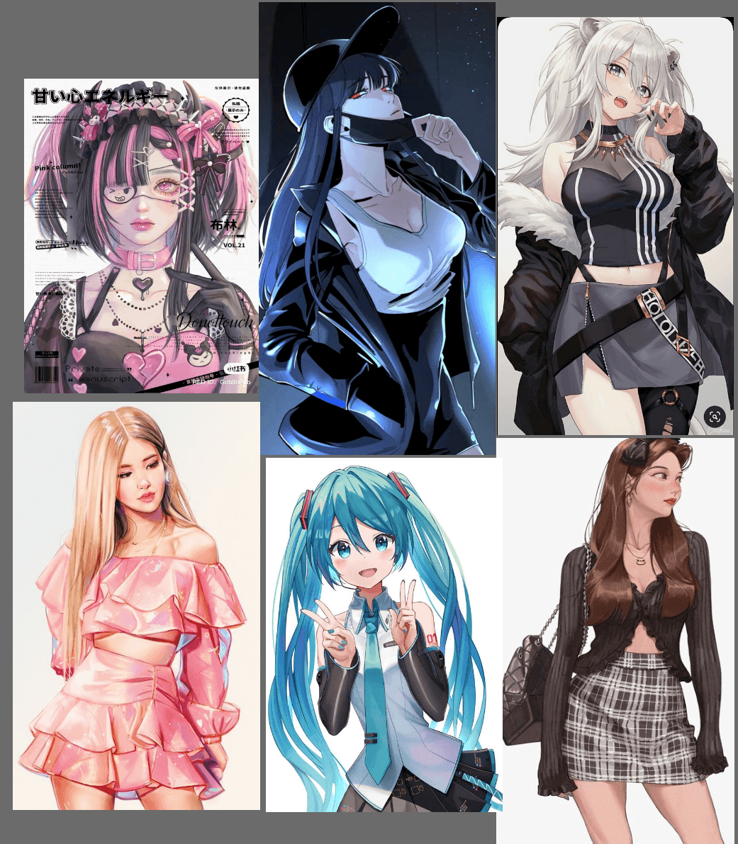
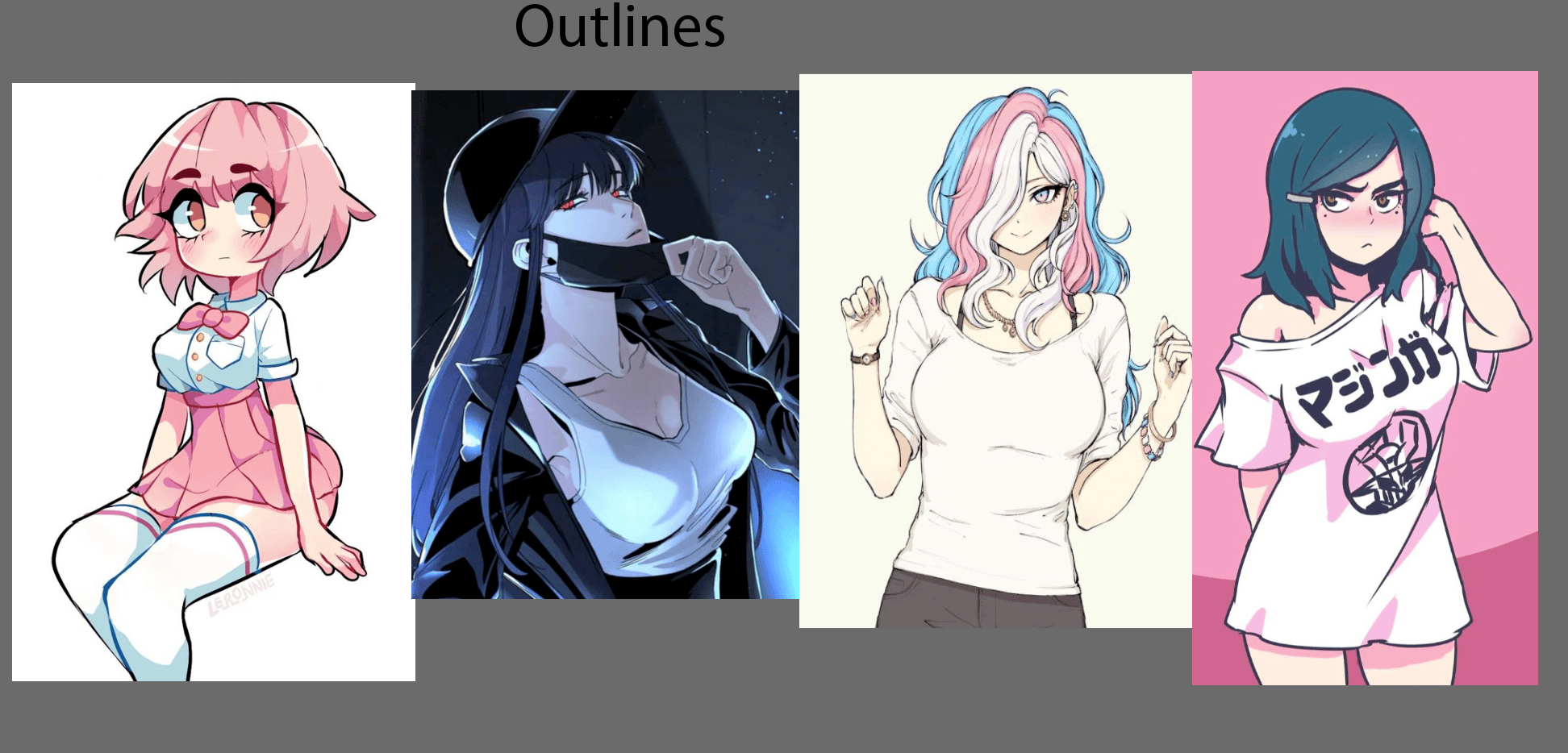
The “Highrise” style can be hard to nail down. Our metaverse is a place where you can find lots of different things, including different styles. Sometimes we take the approach of “do what looks best on that item”, even if it goes against our usual style or bends a “rule”. Sometimes we might render an item differently, add more or less detail, break perspective, abstract something, or apply a lighting effect.
Some things to keep in mind when making these choices: is this appealing? Is this going to look good with other items? Is this going to seem out of place? Is it going to create a good or negative user experience? Is it going to seem buggy or broken?

That said, here are some tips on staying in style. Learning what the typical style looks like will help you understand when to bend (or break) the rules!
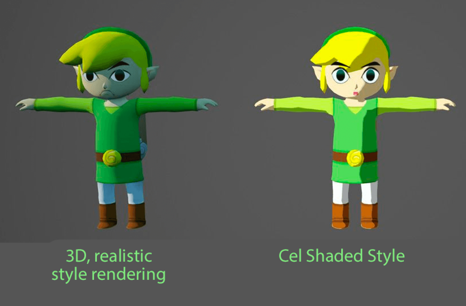
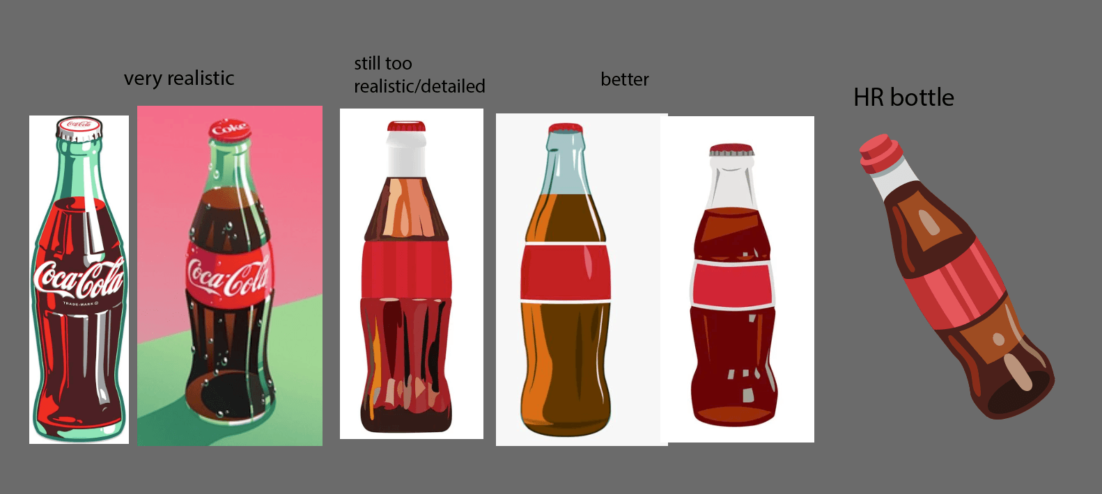
Over Rendered, Too Realistic
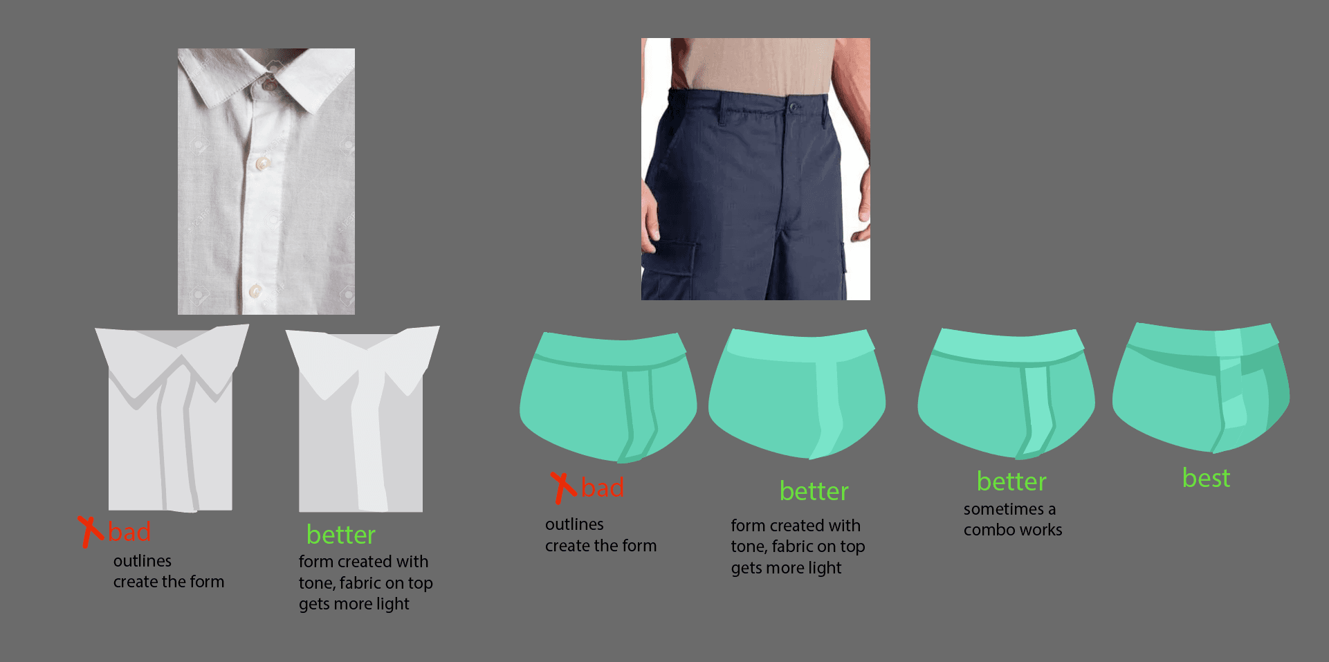
One strong characteristic of Highrise Style is the 2D art. Our style is kind of like cel shading; it’s not highly rendered, overly realistic or 3D looking. Check out the Rendering & Materials guide for more insight.
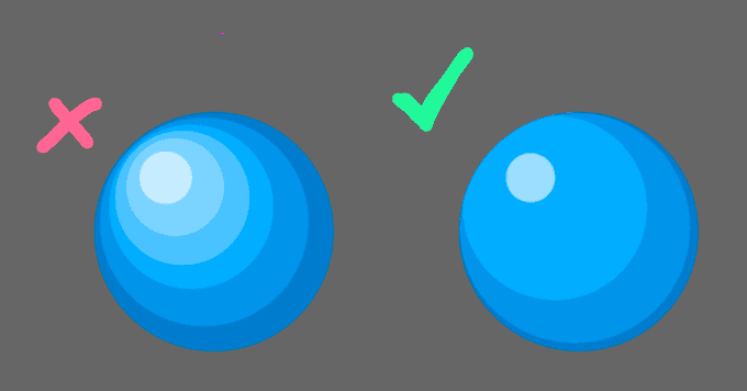
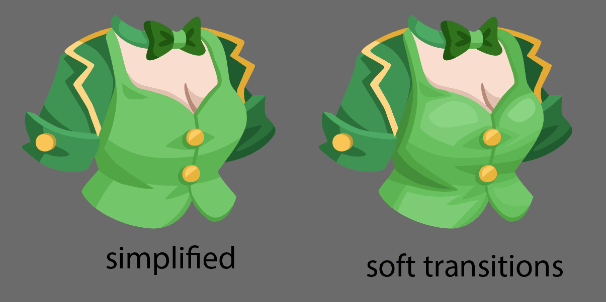
Form is defined with solid, flat blocks of light and dark tones. Often, you can create form and describe plane changes with just 2 tones. Because of technical limitations, we don’t use gradients, and we stay away from using soft transitions.There are exceptions to that which we’ll get to later.
More rendered, detail and realistic than our style
However, our style is not completely flat.
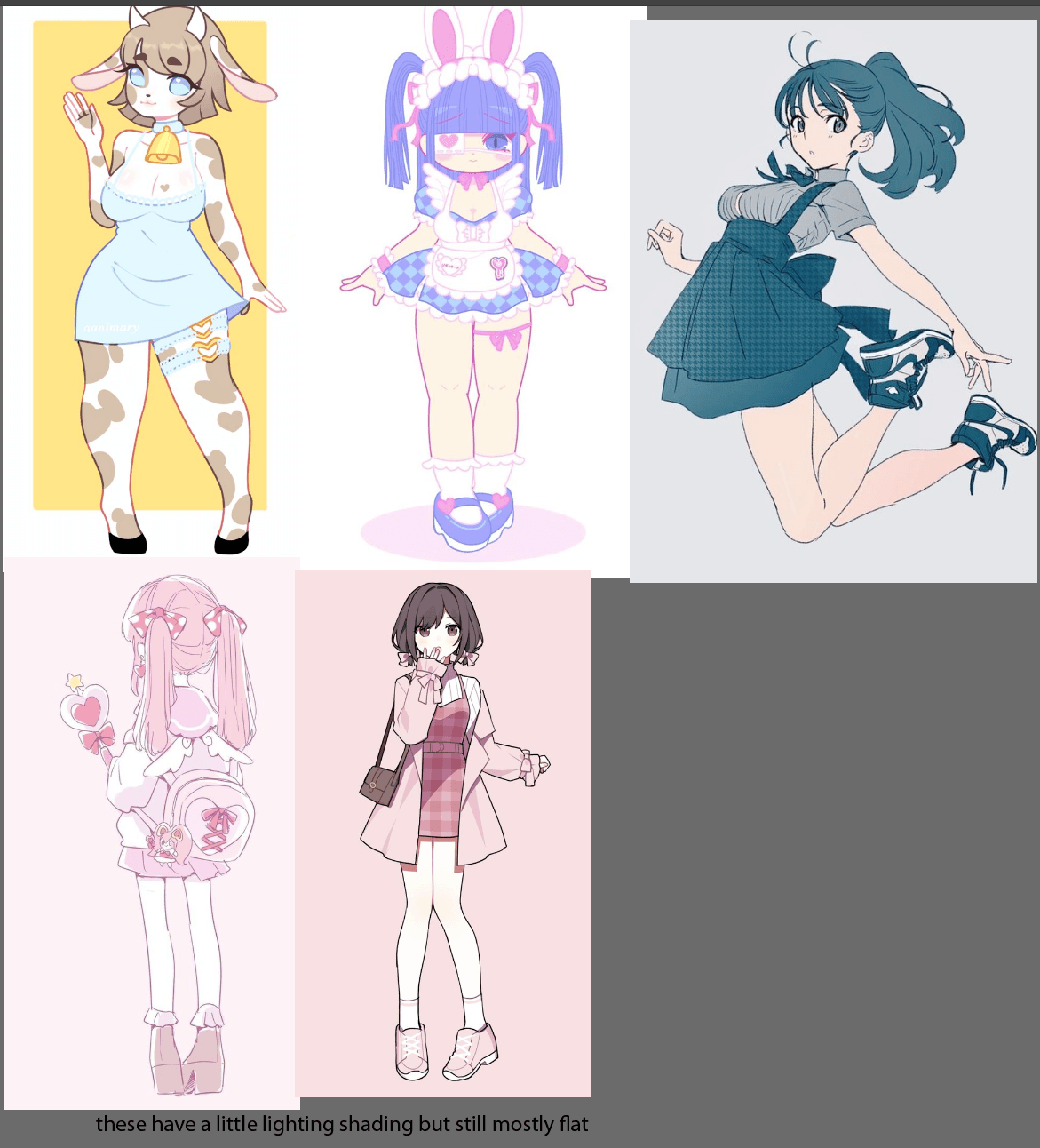
A common pitfall that looks out of style is over rendering, or going for realism. This sometimes results in painterly looking vectors.
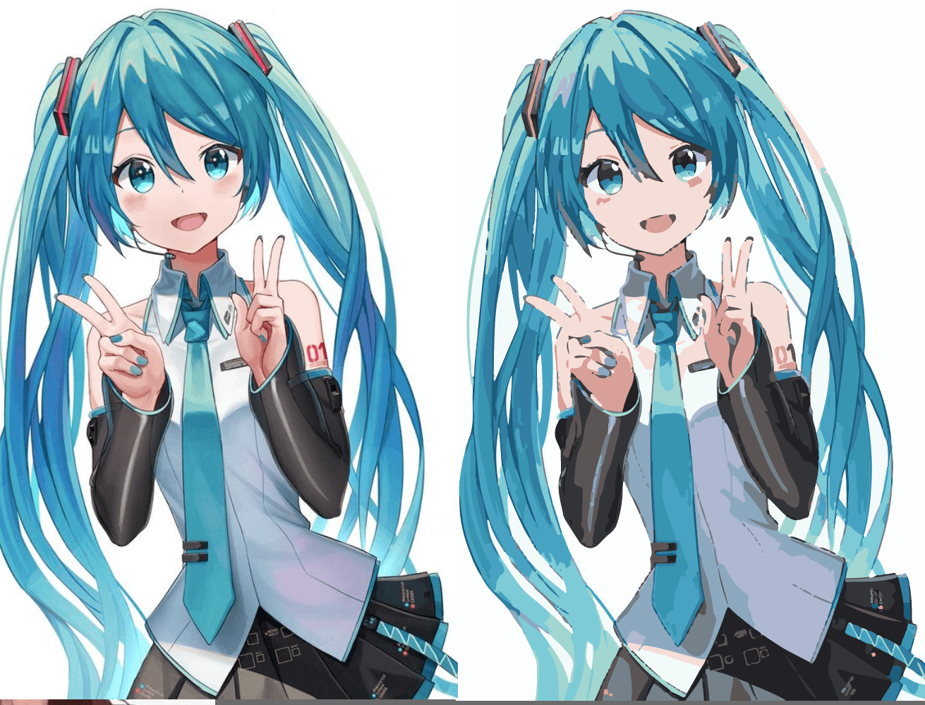
Even if you made this style vector, no gradients, it’s still not going to be right. The hair may be close if you remove the outline effect. Our hairs are some of our more rendered items, but the clothing rendering is far from our style.
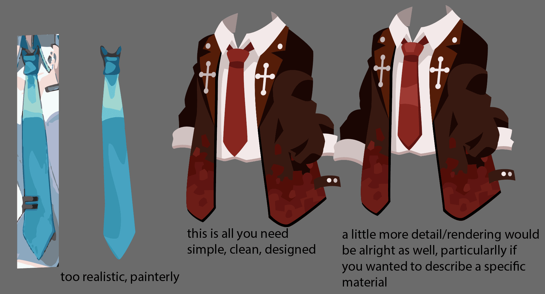
Look at the tie for example: rendering a tie that realistically is not in our style
Exceptions:
- Face items, blush
- Special effects
Avoid outlines
Another distinct feature of the Highrise art is that we avoid outlines.
Using outlines to create form should is a common pitfall, so be careful.
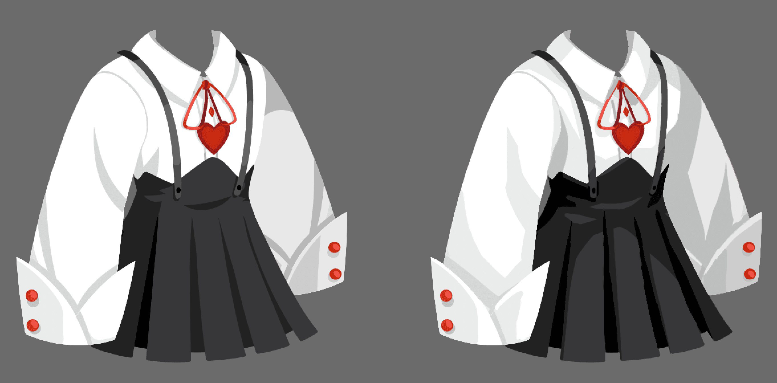
Left feels like it’s creating details with lines, right creates details with form, light and dark tones.
Left is very line based, right is better. This is an old item so it is very simple, but shows how simple forms can be created with primary forms, not lines.
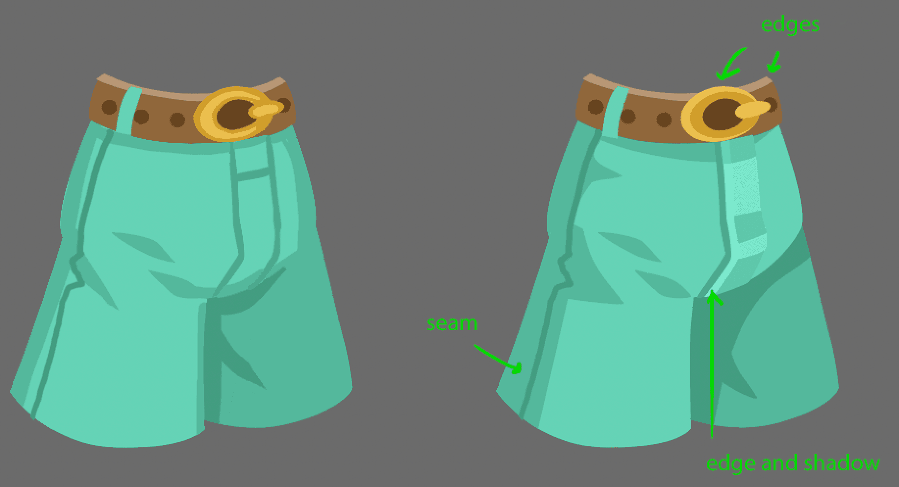
Outlines can be effective when used be used appropriately, like on edges or for seams. Sometimes, a shadow may be making bit of a line. But avoid using lines as the main way of describing details and forms.
Sometimes lines can be used effectively. But try not to rely on them throughout the design to separate forms and plane changes. One tip is to keep the line on just one side or edge of the form.
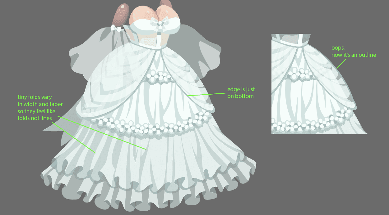
Also varying the line width or tapering the end can help tiny folds read more like folds

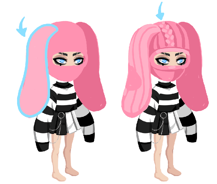
Another tip is to use lost and found edges.
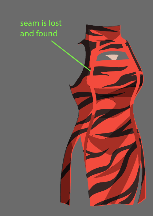
The edging on sheer shirts is a case were we often find a line...
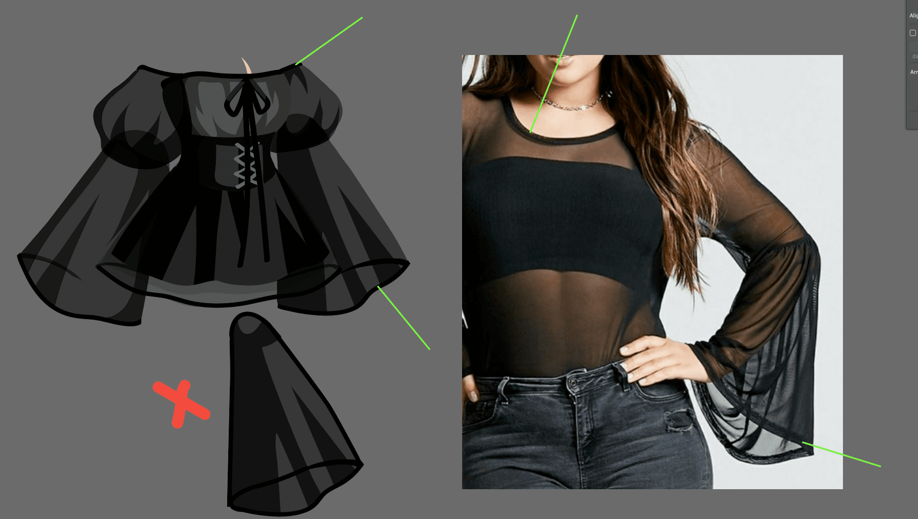
...but be wary of putting the line all the way around.
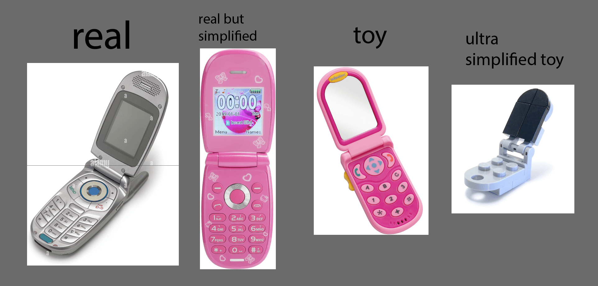
Abstract & designed
Another distinction of Highrise style is that it’s a bit abstracted, it’s not going for realism. There is an element of design to the items.
Be especially careful when using photo references that you think about designing and not just copying. Simplify detail, abstract things and create appealing shapes. Just because you can copy a reference with exact detail and accuracy, does not mean you should!
Back to the tie example:

We are not trying to copy a realistic tie, but design it into something simplified, appealing, graphic.
Keep in mind, simplifying detail is not just about making sure small details render well in game, it’s about creating an appealing design.
I’ve discussed how sometimes clip art can be a good reference for how to simplify and design items in our style, materials and rendering section. Finding the right level of design and detail in the clip art ref is important as well.
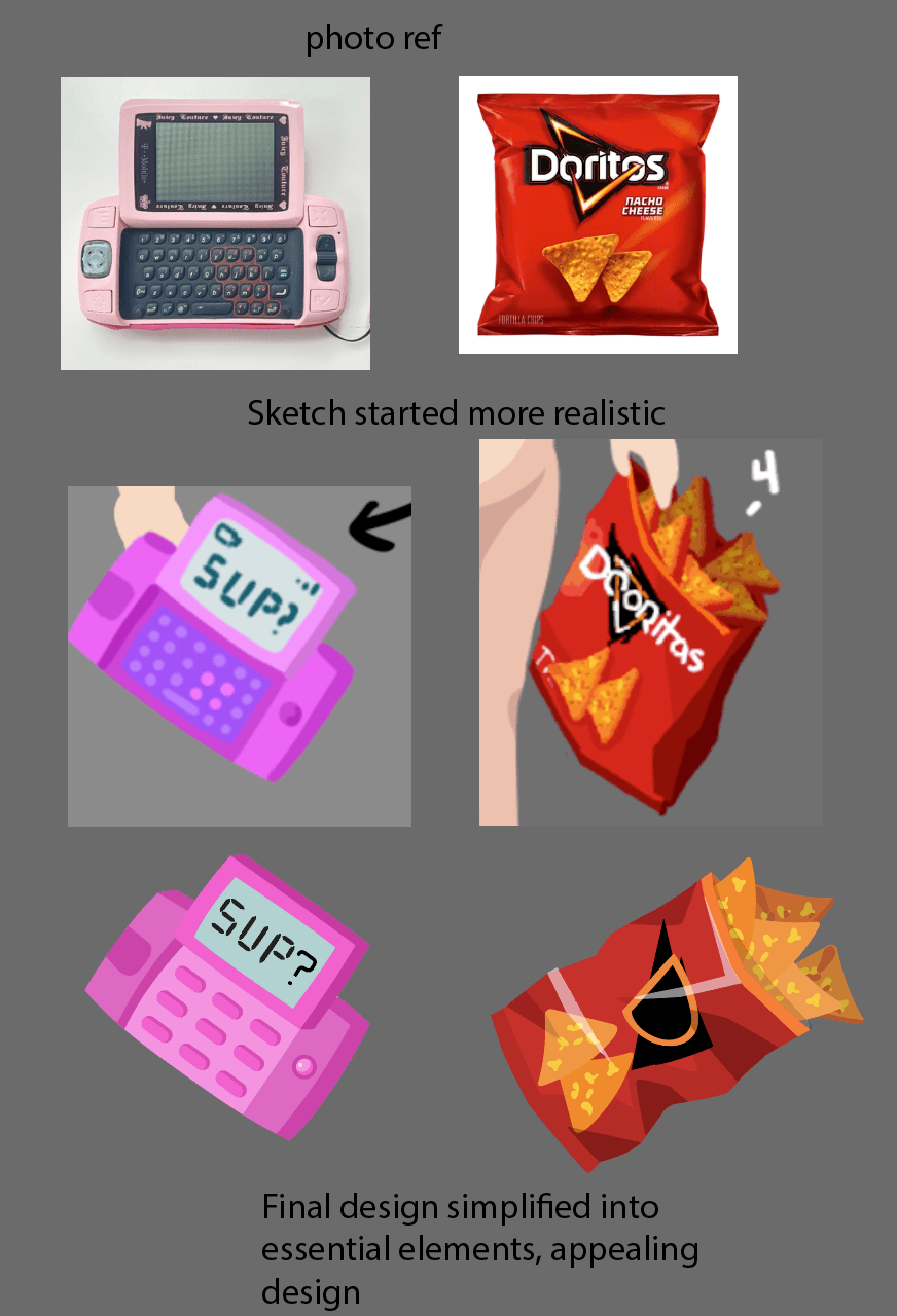
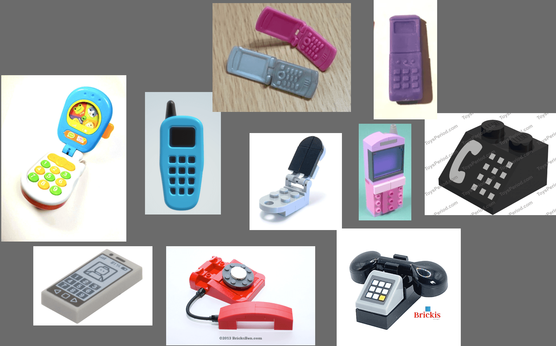
I also use toy design as reference/metaphor. Toy designs are great because they simplify objects into their essential design elements. And, depending on the toy style, they often focus on an appealing design, not realism.
Clothing can also be simplified and an abstracting to create more appealing designs than real life.
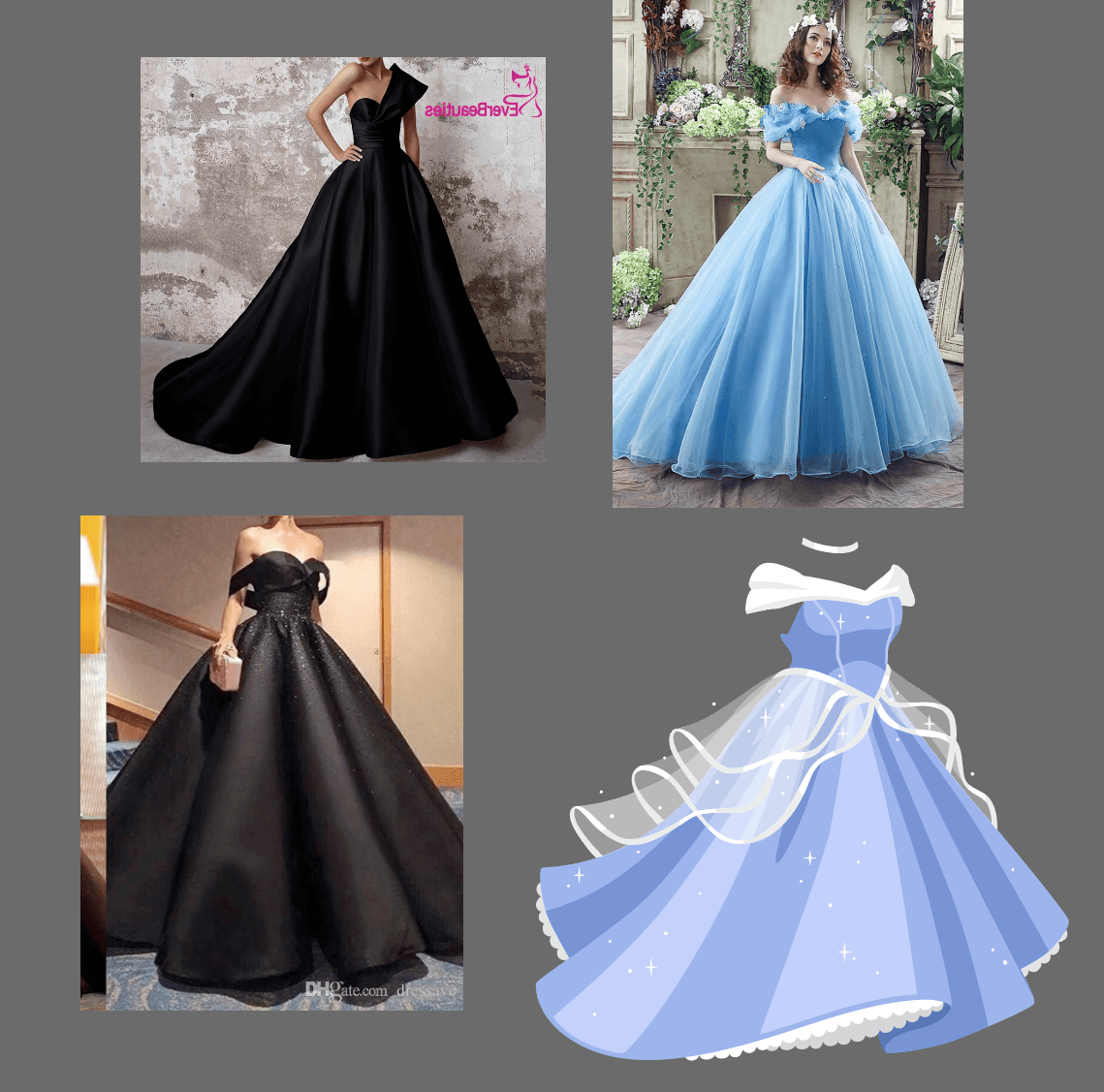
Final design more appealing than the references.
Sketching in our style
Everyone finds a sketching process that works for them so do what works for you but here are some tips we strongly recommend:
- Don’t rely on drawing, block in shapes using flat blocks of tone
- Start with just a couple of tones, then start adding depth and detail
- Work with larger brush size and lower resolution so you don’t get lost in tiny details.
- I work with a solid, no texture, no opacity brush most of the time
- Keep it rough! Try to make your sketch relay the important information about form and detail without doing every little pixel perfectly. This requires some skill and finesse to get a good balance. It can require some thinking and not just mindless, mechanical drawing/rendering. It may seem counterintuitive, but busting out a flawless, perfectly drawn sketch can hurt the final design. You may lose the spirit and flow of the design by focusing on the details. You may over render or slip into a painterly style. Keeping it rough can also force you to find design that works on a very simple level. Try to focus on conveying your intention/design with as little detail as possible. Focus on strong/appealing silhouette and basic forms. Simple details that read without too much rendering.
- Look at other item refs. Always gather references before you start to help you know what you’re going for and give you inspiration. Refs will help you draw tricky things and stay in style.
- Think about how the item looks with other items. Try putting some other items into your sketch to see how the item looks with other wearables in the library
Concepts in the Highrise Style
Start with blocking in the silhouette and planes. Keep in mind the weight and texture of that item, which effects the shape and flow.
This is also important because it translates very easily to the final vectored item, and helps us see how it will read.
A plush material would have thicker details, like in the more detailed image.
Zoom out to check if it’s reading from afar since it’s usually viewed on a phone. This keeps the shape of the item more impactful.
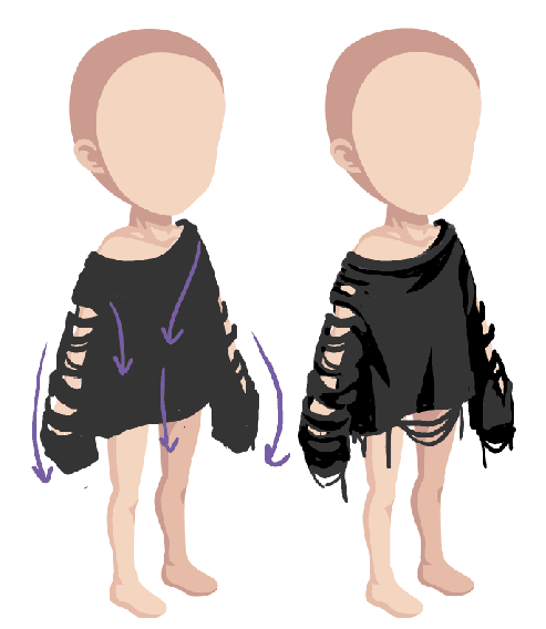
A thinner material that hangs off the body would have longer, more defined folds
The flow of the folds depends on the weight/texture of the material and how much gravity pulls on it.
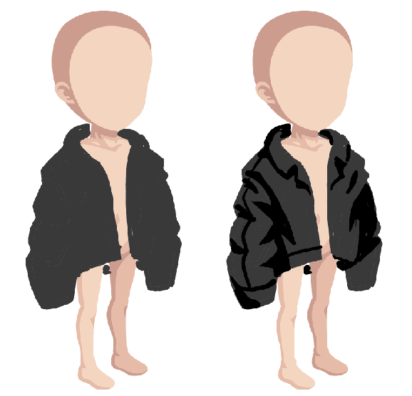
A thicker jacket with a stiffer material would have shorter, thicker folds.
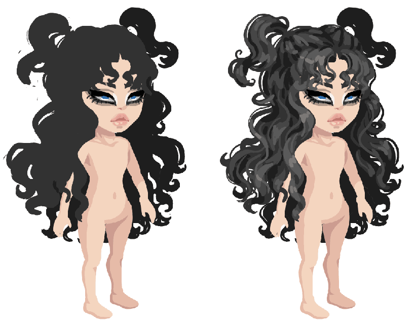
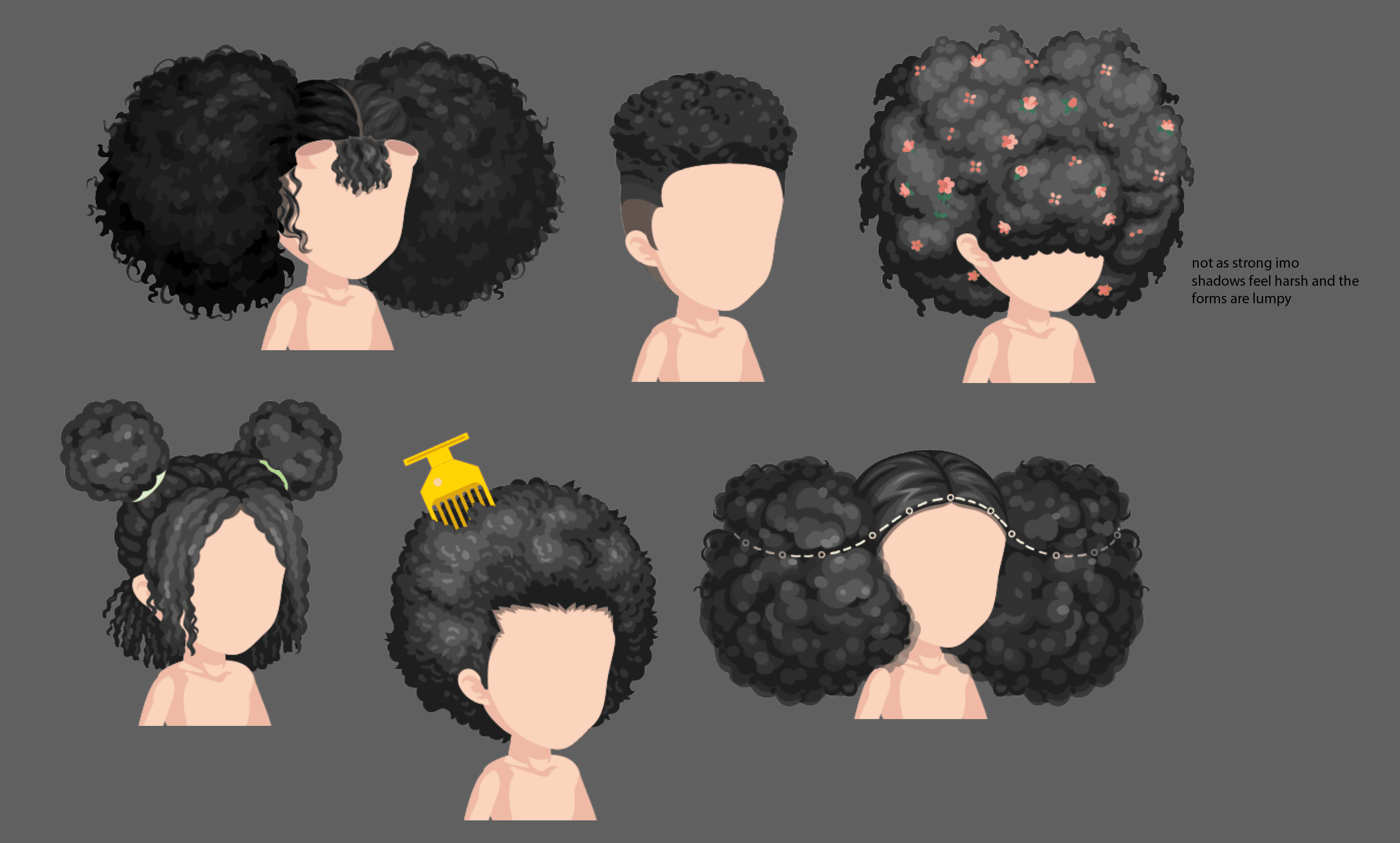
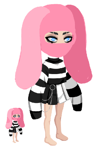
The same rule applies to hair, start with the silhouette to see how well the shape reads.
Then add detail! and more stray hairs to the silhouette!