Face Items
Face items, like hair, are a big part of representing a certain vibe and expressing individuality. It's no secret: everyone LOVES face items.There are plenty of free, basic ones available, so when we make new face items, it’s good to put some extra love into them to really make them special and stand out. Here are some popular looks:
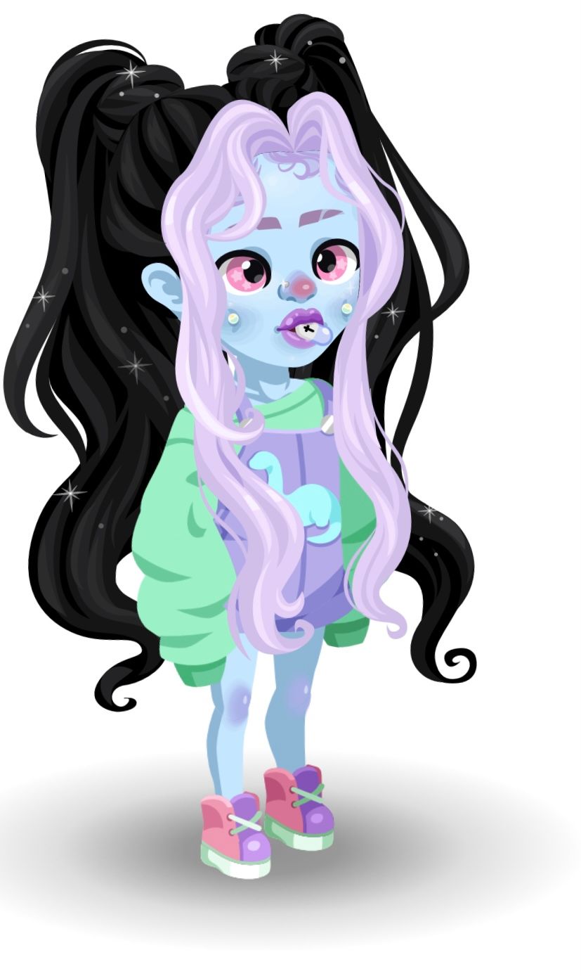 Hello World! Eyes, Opal Dimple Piercings, Unholy Pill Mouth, Rosy Cutie Clown Nose
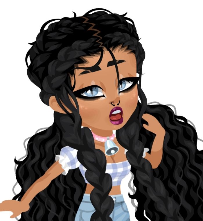 Sphynx Eyes, MuthuR Beat, Sweet Lov Mouth, Septum Nose, Shaved Short Brows
Some current face item trends:
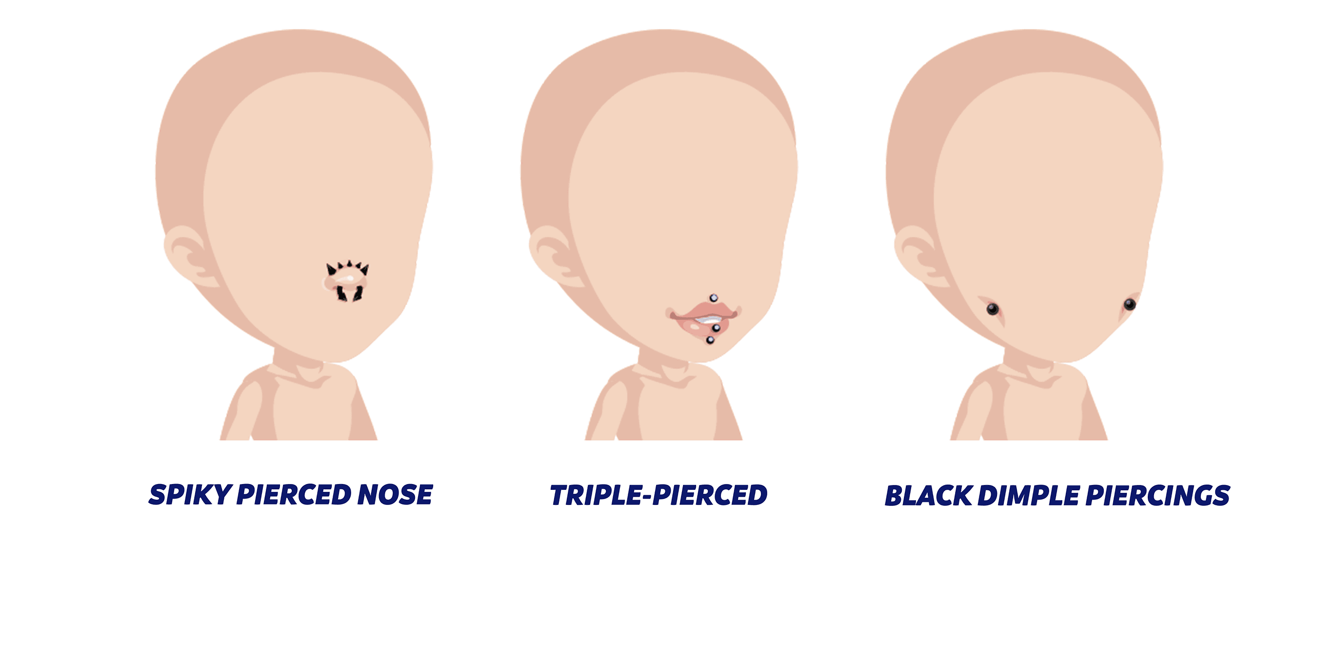
Piercings
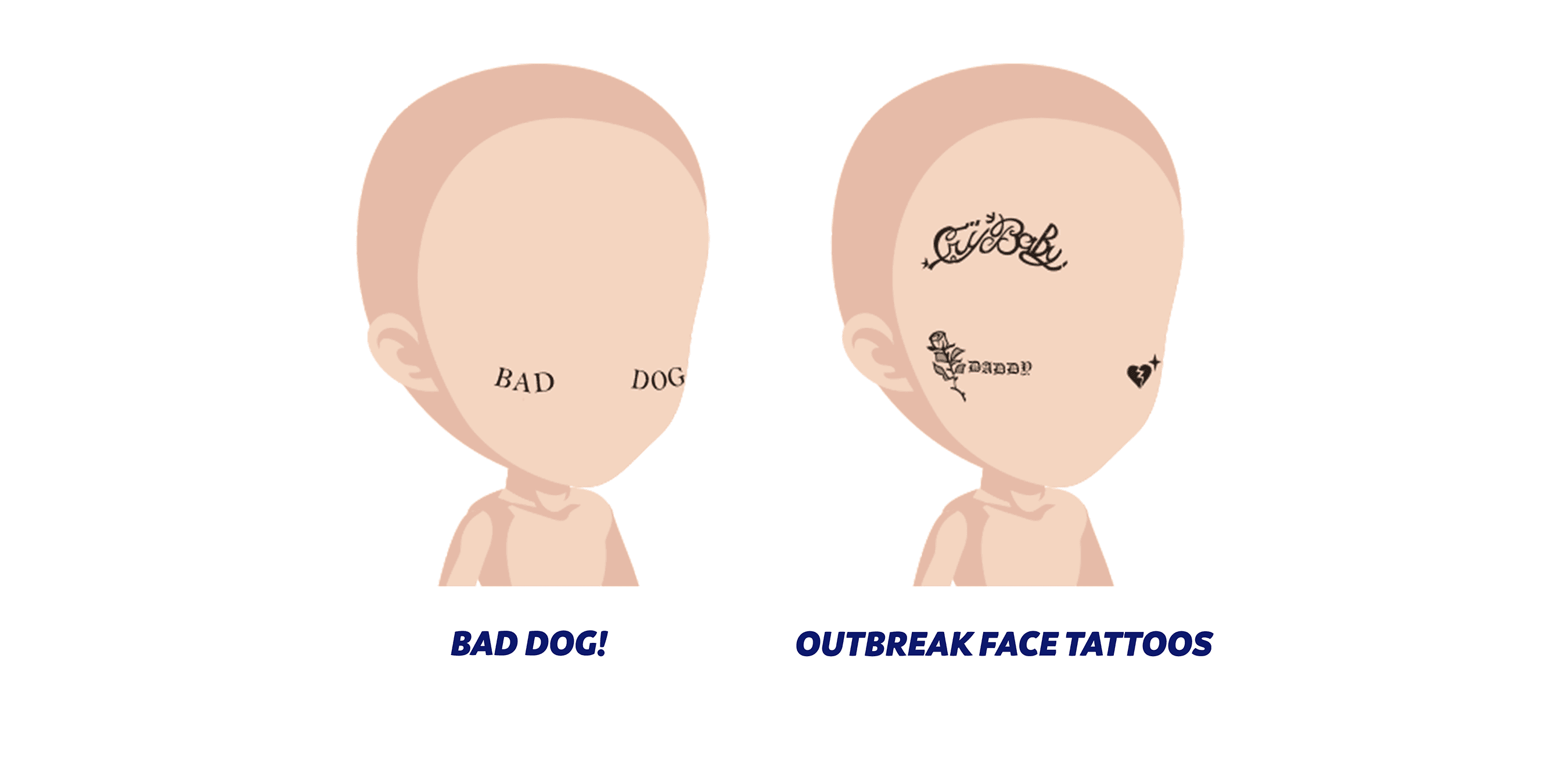
Face Tattoos
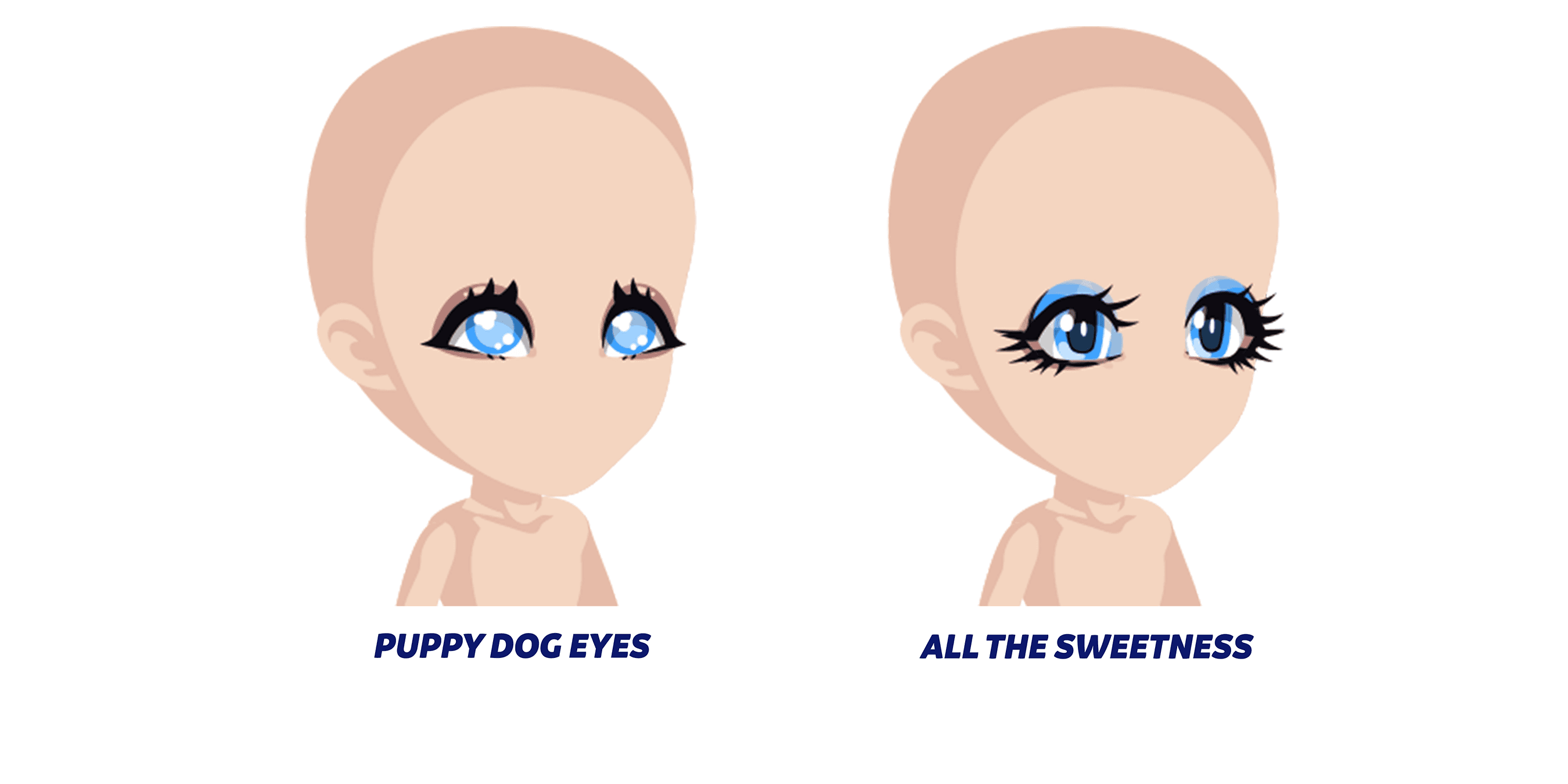
Big, Expressive Eyes
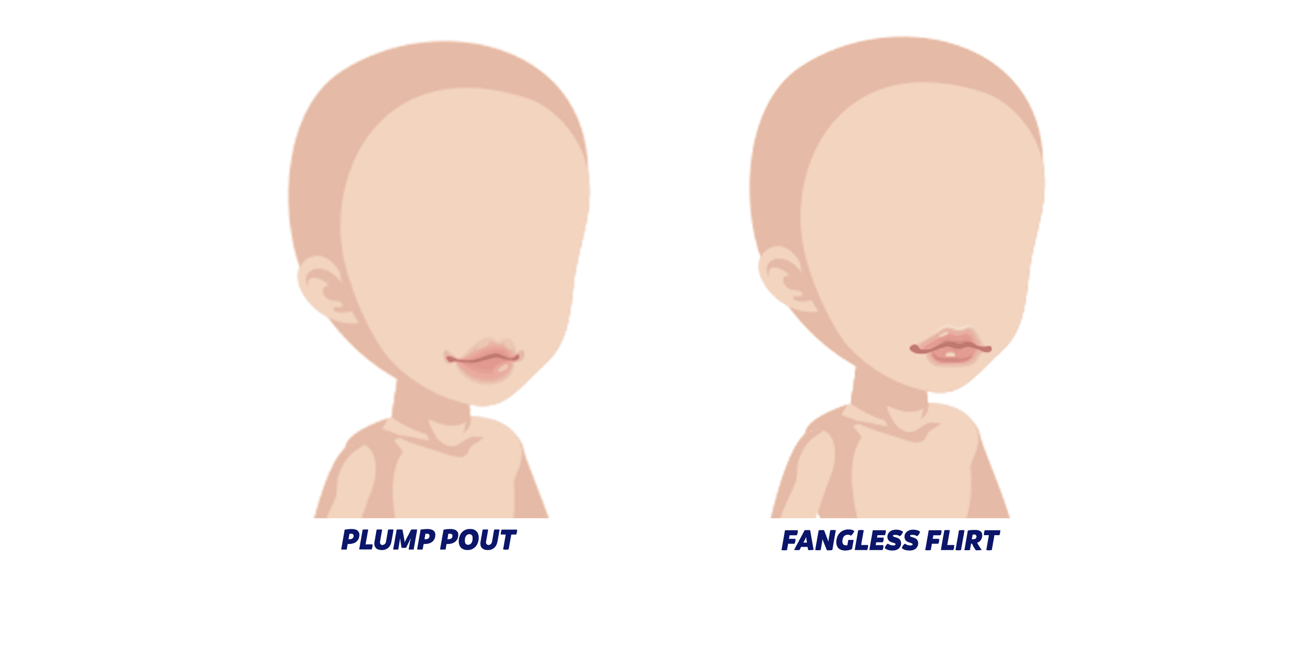
Soft, Ombre Lips
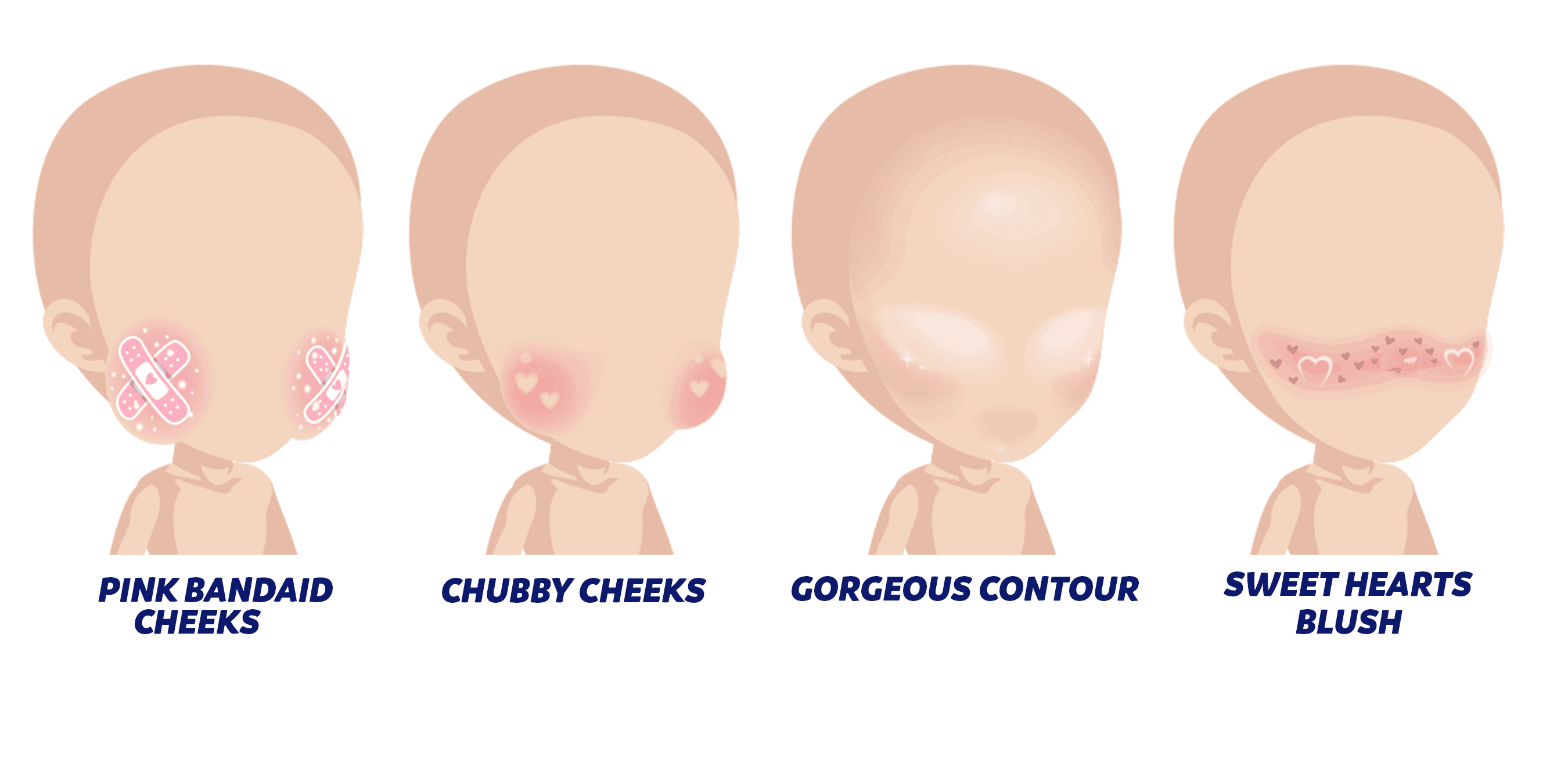
Cheeks & Blush
Alignment
In general, we try to maintain a consistent alignment for face items so that we can easily combine any number of different items and aesthetics. However, you can push the proportions and placement a little to give more dynamic personality:
- Bigger eyes placed a little lower on the face will create a cuter, more chibi look.
- Smaller eyes with more attitude make the avatar look more mature
- Lip and mouth size can be exaggerated to create a more expressive look
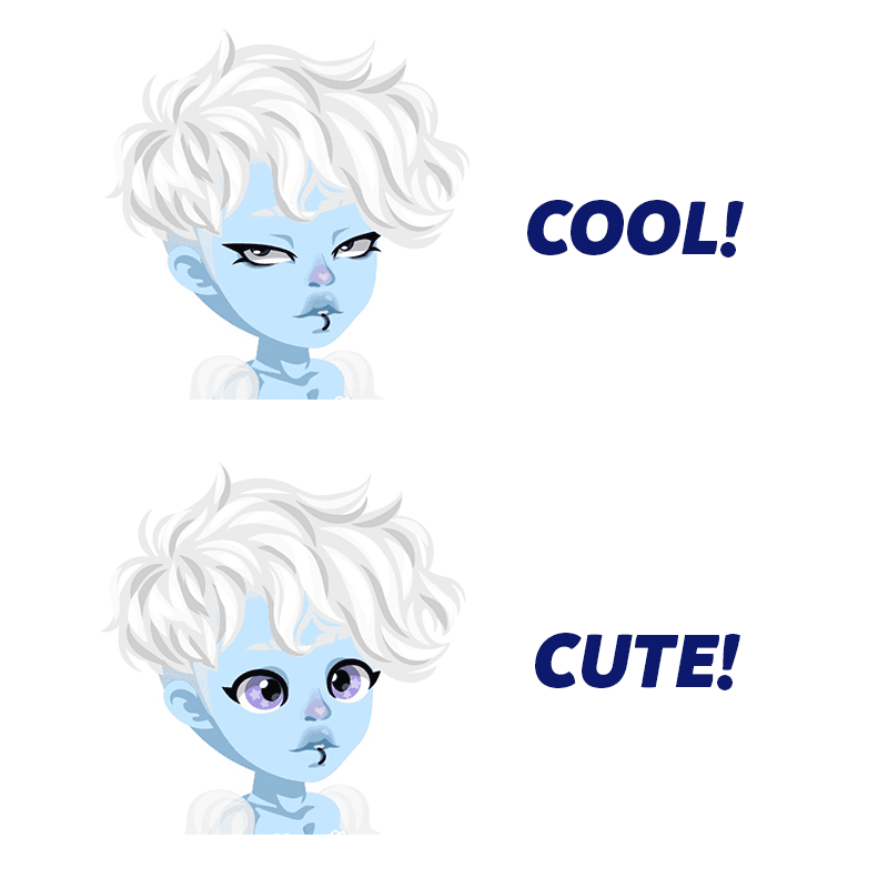
Expression:
Most people tend to veer either cute and silly, or edgy and cool. Try to design items with this in mind. What type of expression are you trying to make and why? What mood are you trying to set?
- Add teeth only if it adds to the expression
- Try not to make the items too realistic. An exception to this guideline would be makeup, which uses lots of low opacity layers for subtle shading.
Some examples of mouth styles we lean towards:
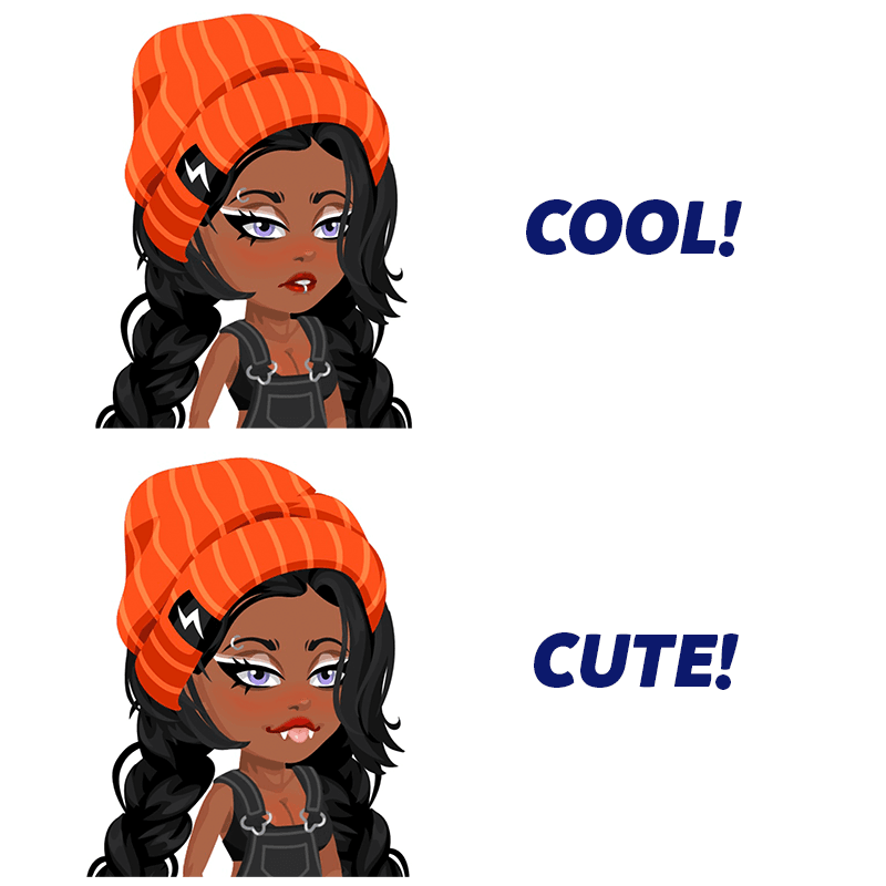
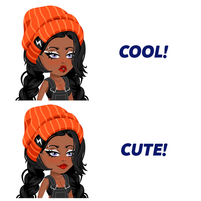
Folks don’t tend to like big goofy smiles or mouths showing a lot of teeth.
Some examples of what we want to stay away from:
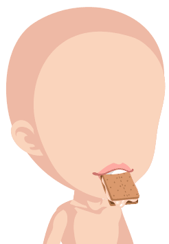
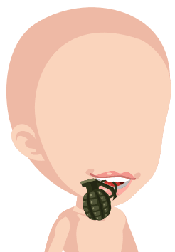
These are too goofy, and would be better without the teeth, or less of a smile.
Avatar Skull
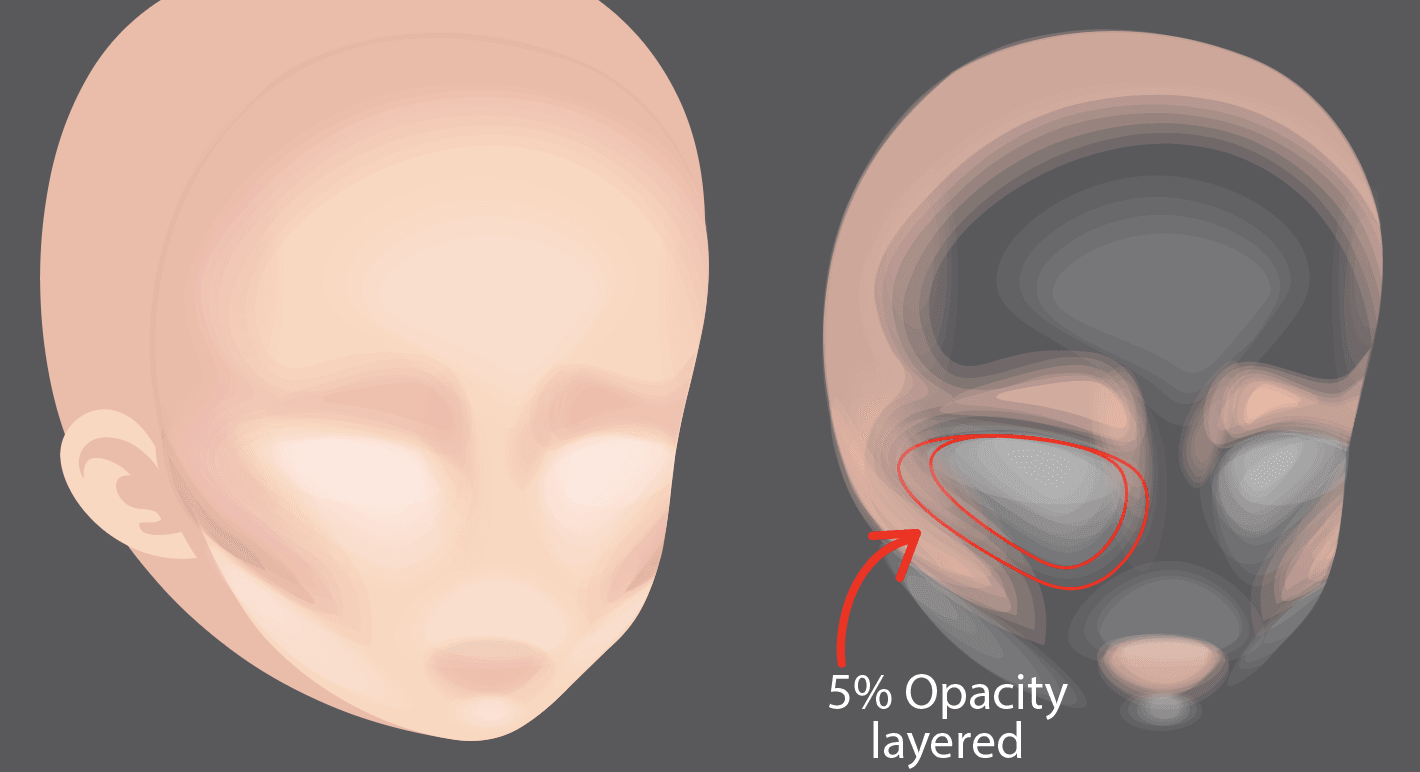
This is how we think the skull of the avatar would look. If you feel you are struggling with believability and placement of face items, use this as a reference.
![]()
GRAPHIC VS GRADIENT:
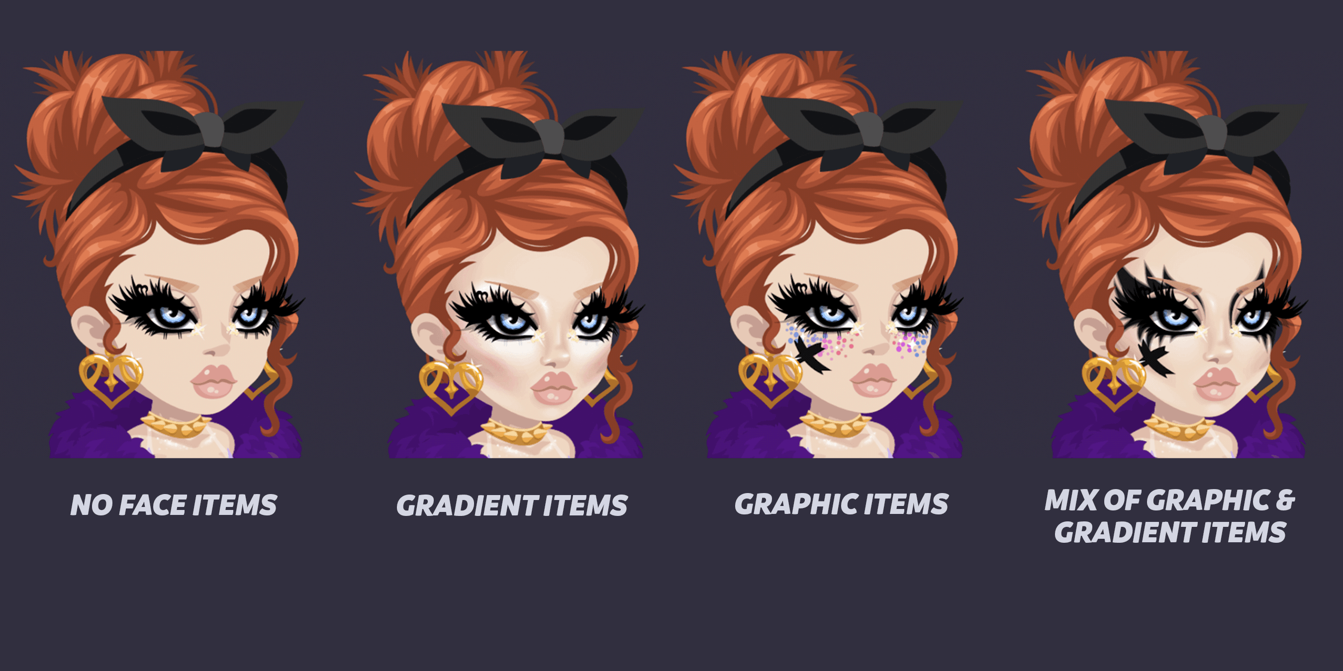
When creating face items, you need to establish when to put the detail in and when to keep it simple. Here is a lineup of the two types of approaches to face items.
Graphic A graphic approach to face items is simple, lacking many layers. Graphic looks are simple, bold, effective ways to add mood and attitude to a face. Think face paint & stickers.

Gradient A gradient approach is for the insta baddies, the dramatic and high-definition lovers. Gradient face items consist of MANY layers, with varying levels of opacity. If you picture this item in real life, and you would need a Youtube tutorial to learn it, it's most likely a gradient item. SLAY!
Start out with the bottom layer at a 1-5% opacity, and you can either layer with the same level or gradually increase it in increments of 2-3% depending on how severe you want the color to look on the face. C’mon drama!


Here, you can see opacity layers going up by 2% on the left VS. opacity layered at the same level on the right.
