Material & Rendering
Rendering:
Our rendering style is somewhat like cel shading. We don’t use gradients or soft transitions. We describe form with simplified plane changes.
For a breakdown of drawing in the Highrise style check out our Drawing & Designing guide!
Shading/Shadow Tones
Generally you want to increase around 510 digits saturation with 1015 digits brightness.
This helps an item stay bright and saturated without it getting muddy.
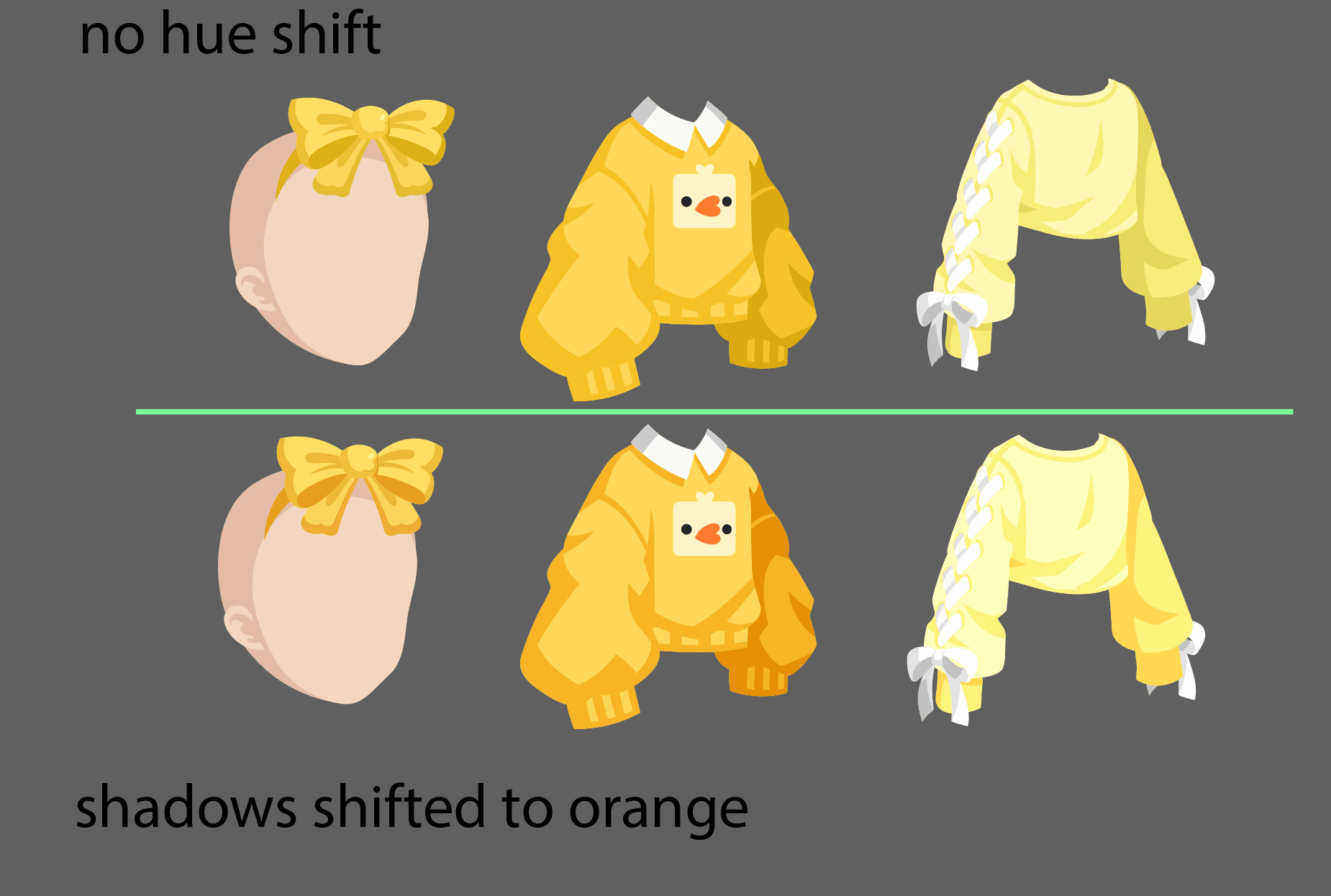
Generally, we make our shadows more saturated but don’t change the hue. However, sometimes a little hue shifting can add nice dimension to the item.
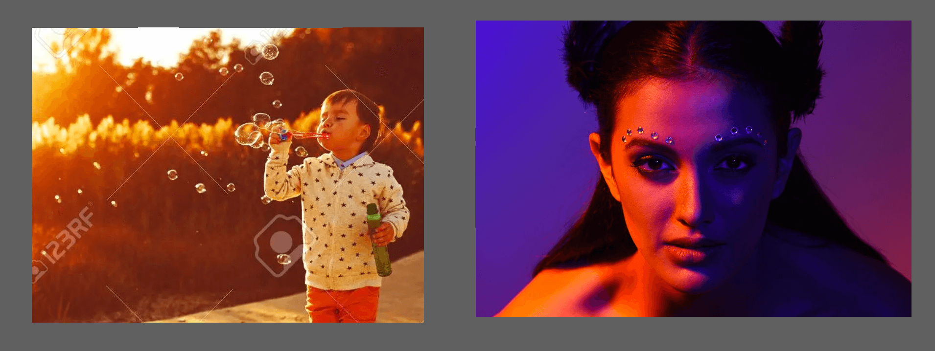
However, this can lead to issues. The items sometimes looks like it’s under a different light effect or has a filter on it, which looks really cool in photography or concept art, but not in our game where we want to have consistent lighting.
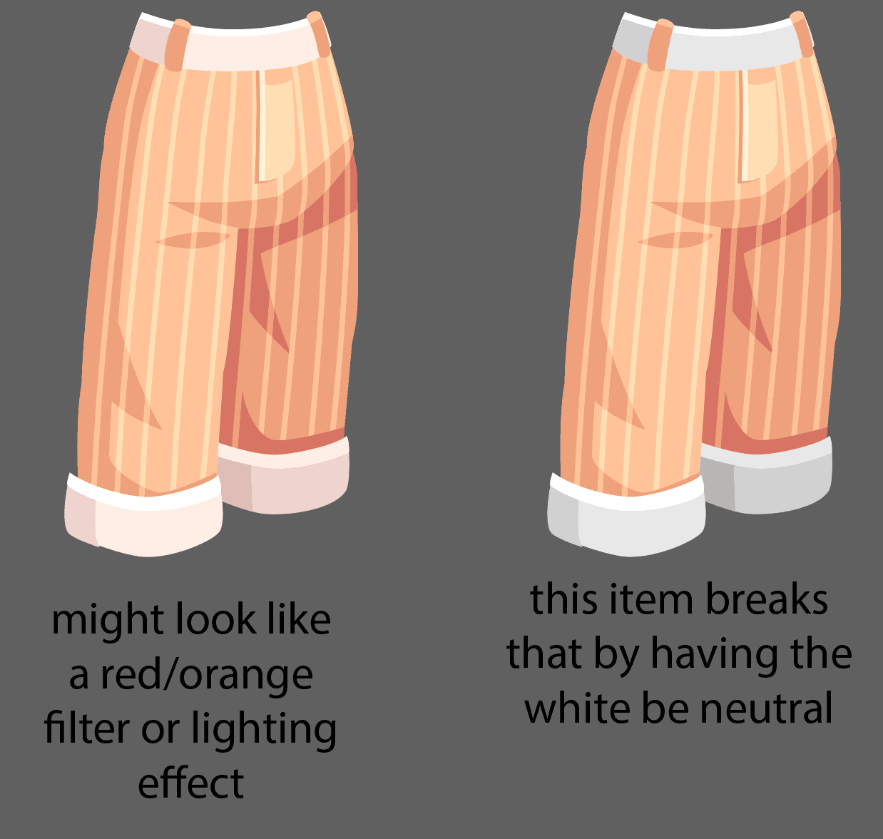
Another issue is that when we do this, often the hues we shift to don’t match. It’s particularly obvious on white items.
So it’s best to use hue shifting very minimally, if at all.
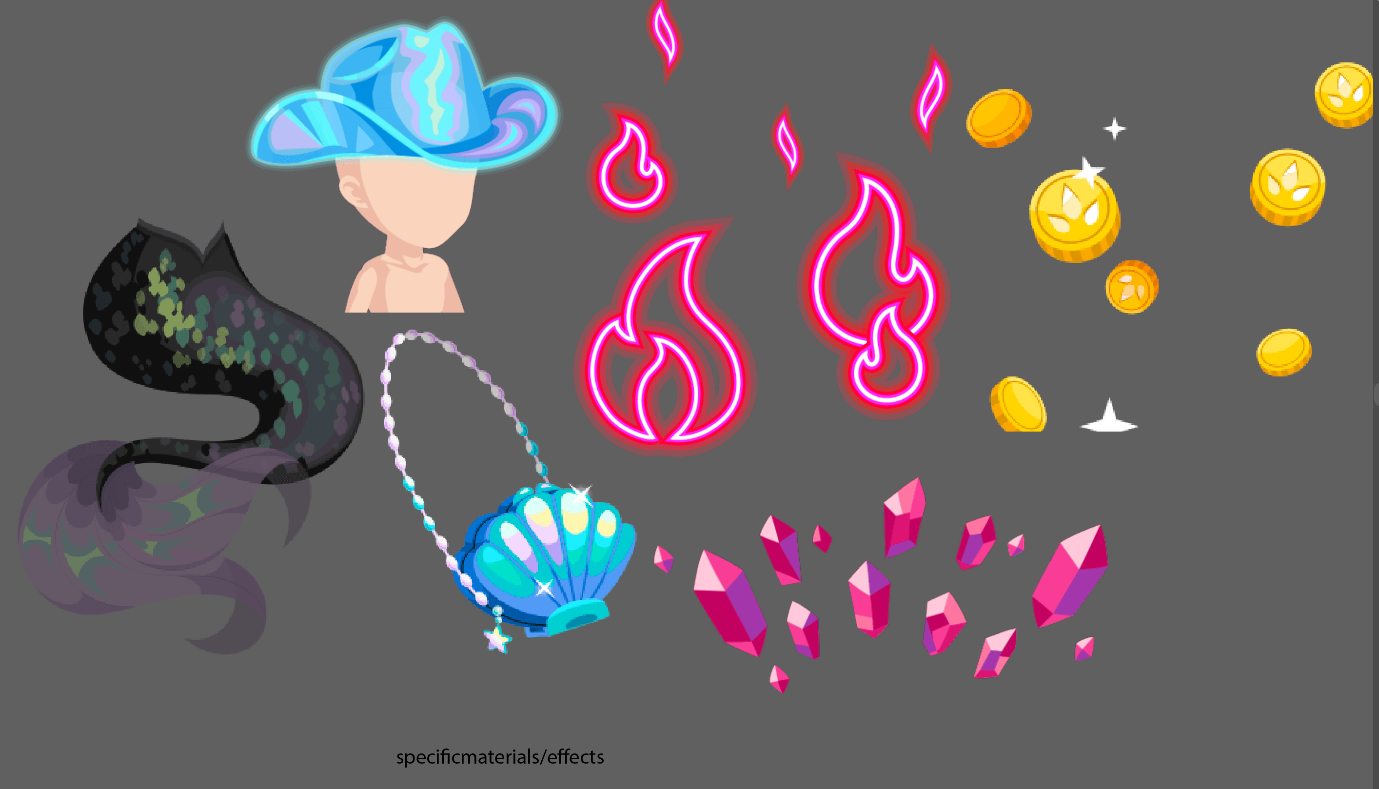
Exceptions are particular materials, like iridescent/holo material, gemstones, neon, gold.
Another exception is the use of the color yellow. Yellow can be a very tricky to shade because dark yellow tends to get kind of muddy/brown. Good practice is shifting the darker tones to yellow colors to be more orange.
Rendering a Shiny Object
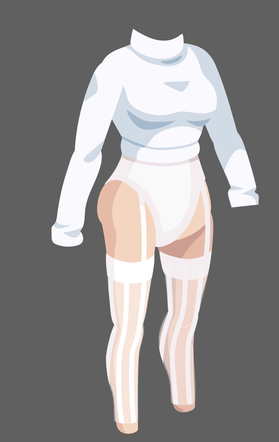
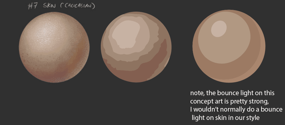
In general, we don’t want to over render an object. Over-rendering can leave an item looking like a fake 3D rendering, which doesn't suit our game style. The basic idea is to capture the base color, a layer of shading, then add the darkest shading or brightest highlight if needed (but this is usually subtle). Ideally, a general textured object (like a cotton t-shirt or skin) would only have two to three tones of shading.
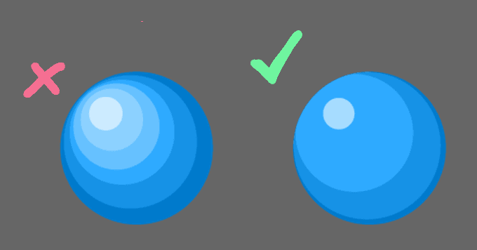
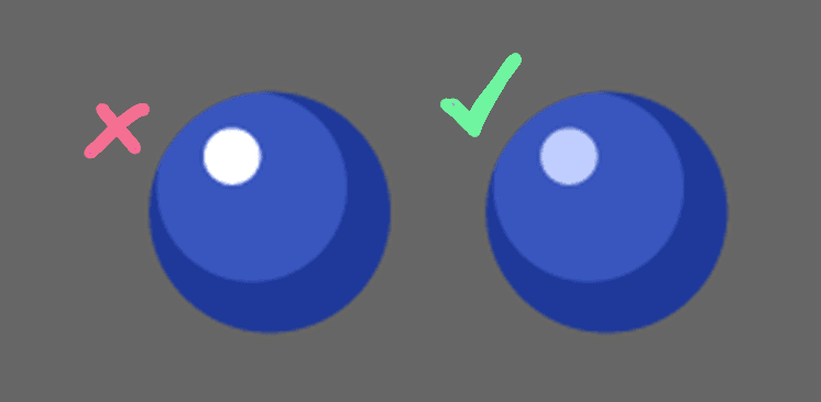
When adding bright highlights, try avoid using pure solid white. With darker colored objects, this can look somewhat graphic and flat. Using a bit of the tint from the object colors would render better.
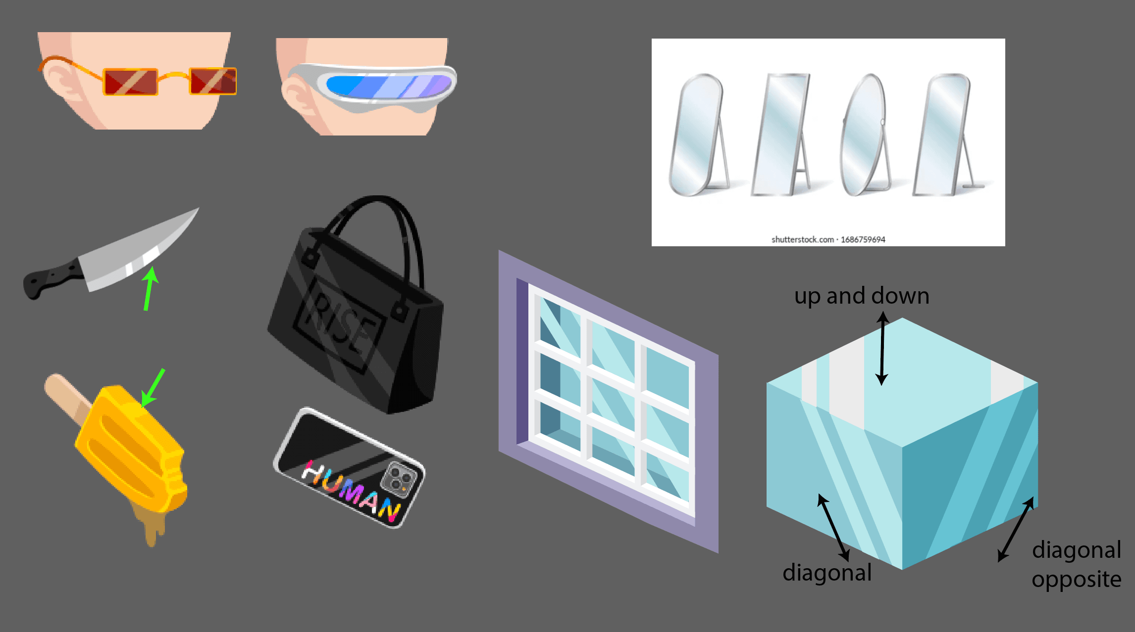
Shine lines
Sometimes on flat, shiny surfaces we see these diagonal lines of highlight. In some cases, it indicates a subtly curved surface reflecting a strong, directional light. On extremely flat surfaces, like a window, you can think of these lines as a reflection of a ray of directional light. On furniture, you may see it on windows or floors. Generally, on furniture you’ll see it applied diagonally on the side planes, and straight up and down on the ground or top plane. It’s a little bit random and probably not extremely realistic! Because it’s not super realistic, we try to avoid using it too often, especially because the lighting can feel off and not match when mixing random assets with random strong, directional light.
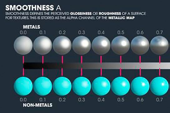
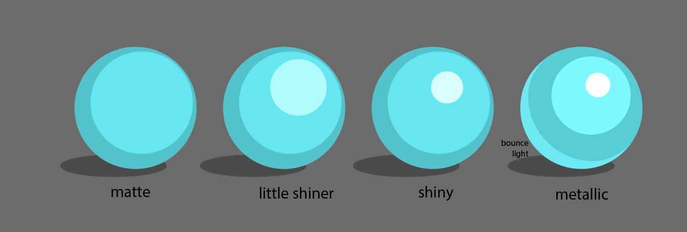
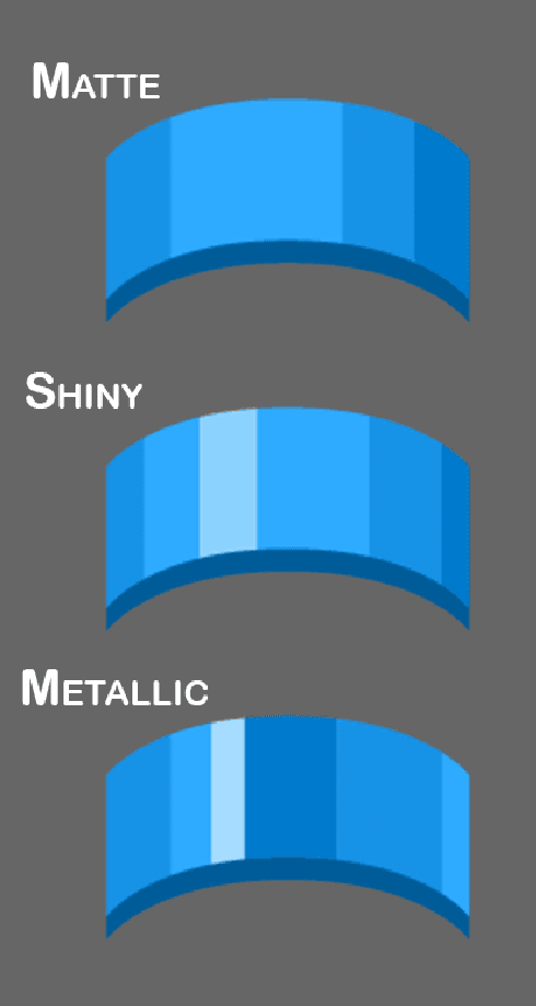
Material
The material of an object determines how you highlight and shade it.
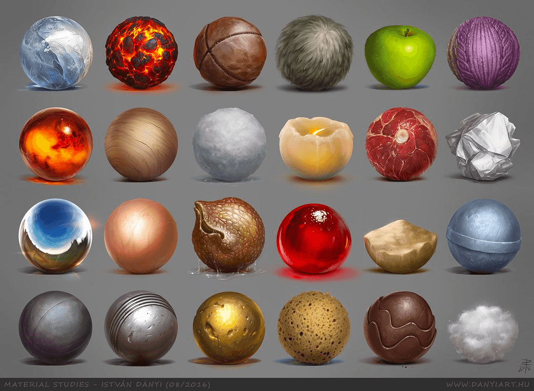
This diagram of 3D spheres shows how the shading & highlight looks different on matte (rough) vs shiny (glossy) materials.
Here is an example of rendering that in vector:
On a different shape:
Note:
- Matte has no or fewer highlights
- Shiny has brighter, smaller highlights
- Metallic has a shiny highlight with the darkest color being next to the highlight (bounce light)
Metal
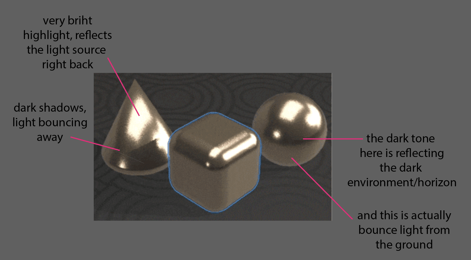
As discussed above, an object’s metallic quality (or roughness, glossiness, and reflectivity) is a basic principal of material. A more metallic material bounces more directly, so it will have brighter highlights, darker shadows (ie higher contrast), and sometimes bounce light. An easy trick to making a material more shiny or more metallic is to make it have higher contrast and more transitions in contrast. You may also find a bounce light on metallic materials. Or you may alternate a dark shadow next to a highlight, as a trick to simulate the direct reflections of metal.
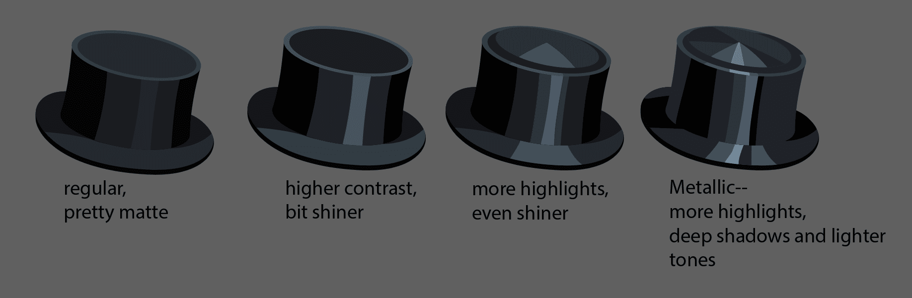
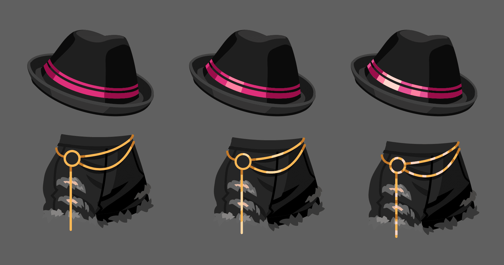
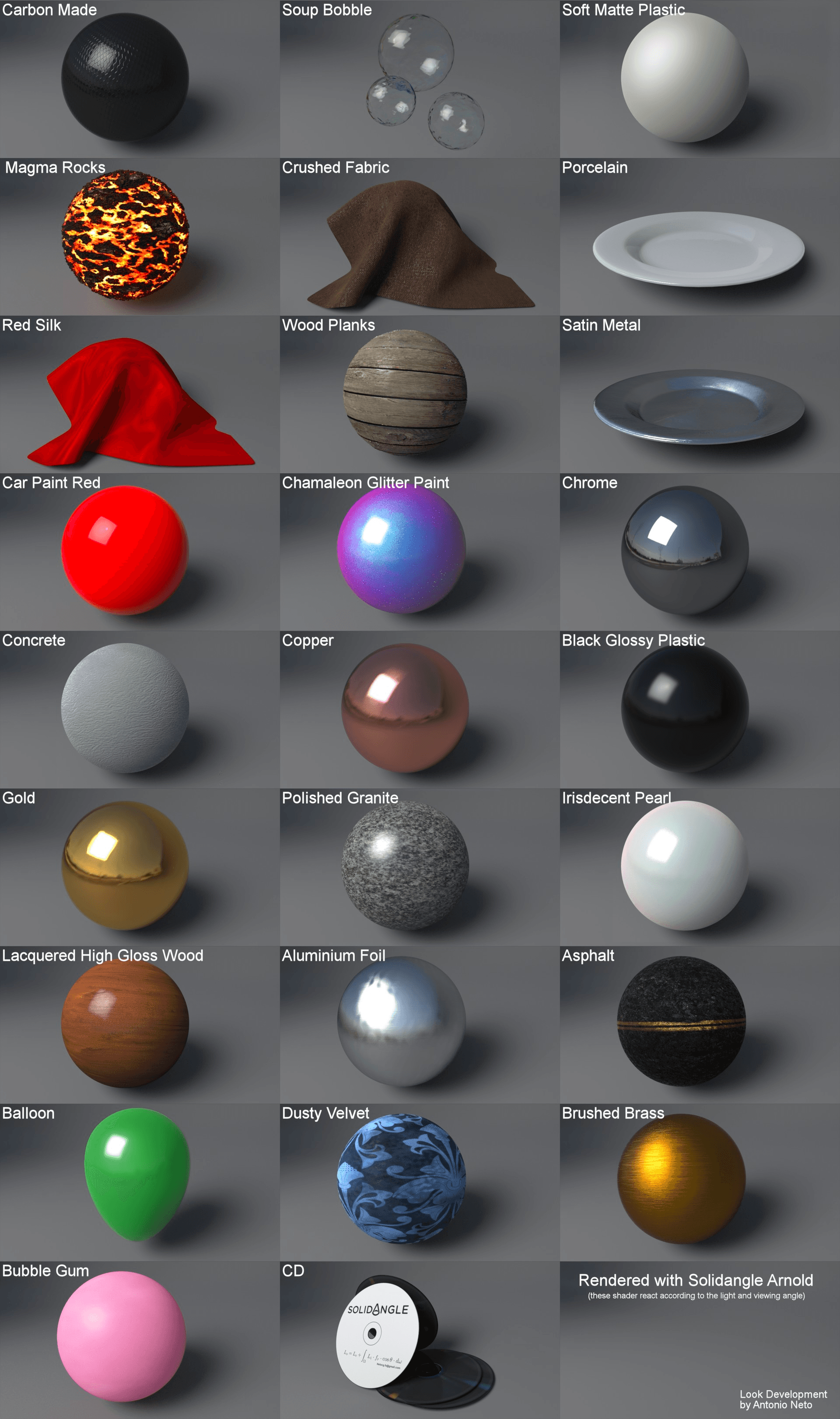
Some examples:
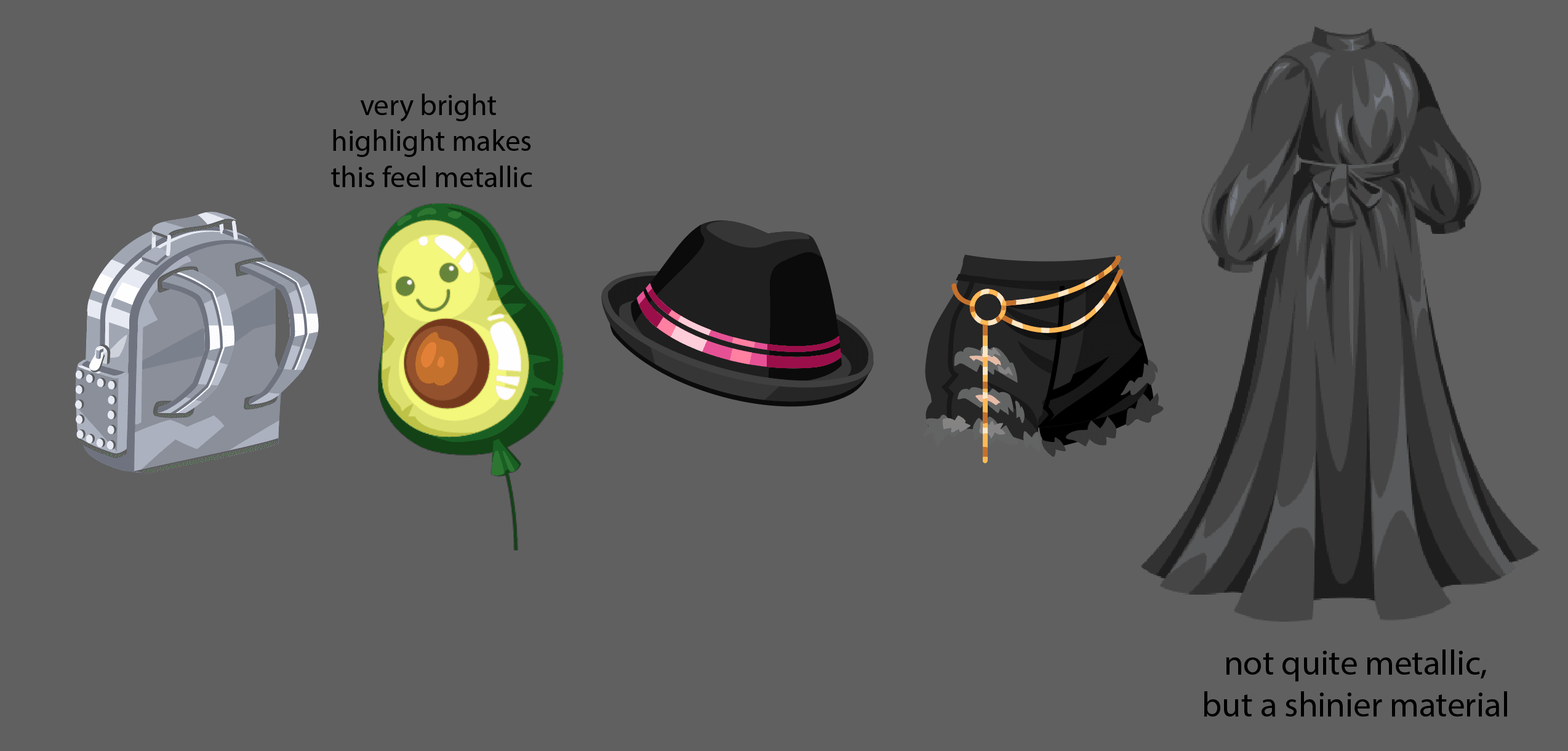
See how the difference in rendering will make the materials of the detail appear different than the base material of the hat and shorts.
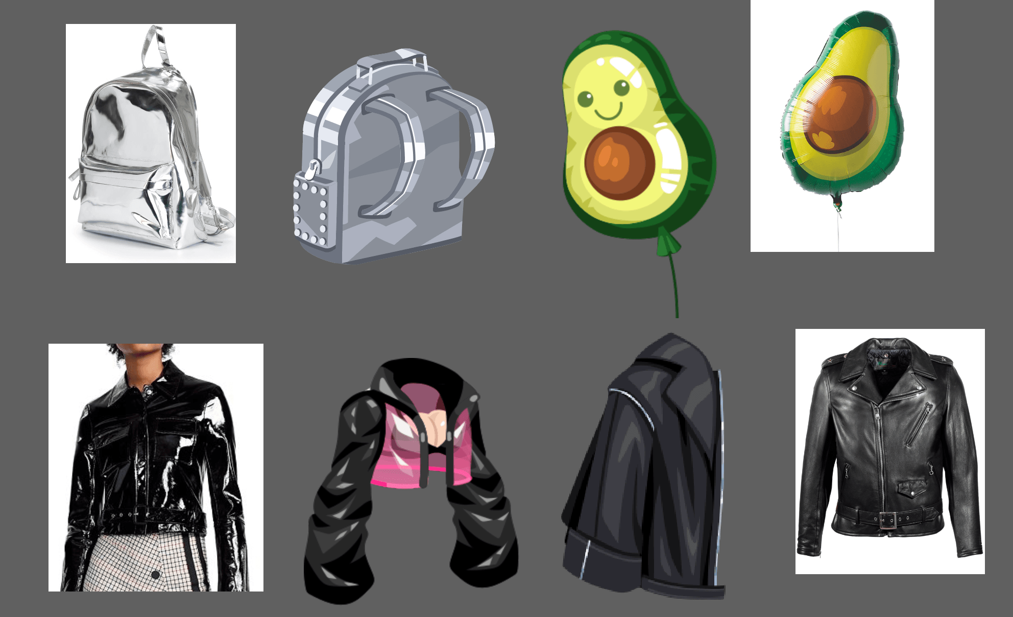
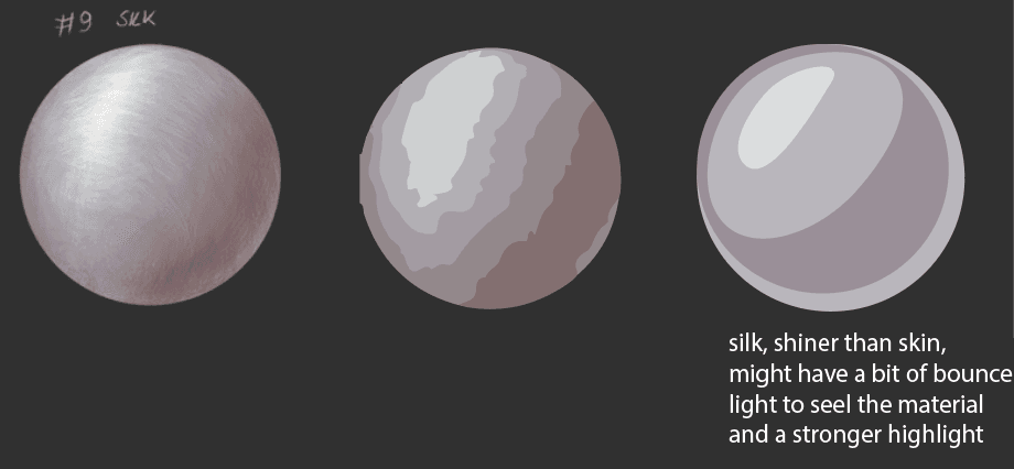
Silk, Leather, Shiny, Plastic-y Fabrics
These types of fabric are all just shinier versions of matte/cotton type fabrics. They aren’t as shiny as metal, but use the same principles - brighter highlight, darker shadow, sometimes a bounce light or alternating the dark and light tones. These examples demonstrate different levels of shininess:
Materials - Shape and Draping
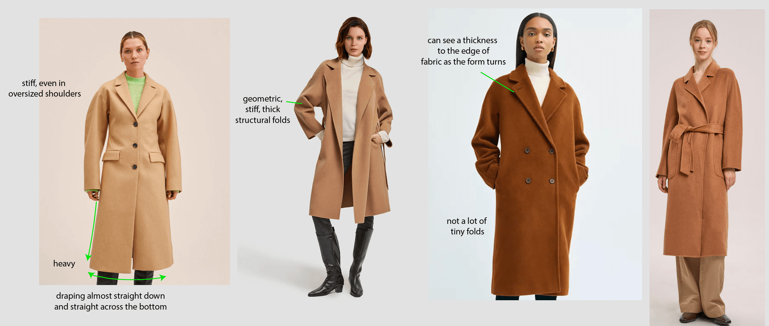
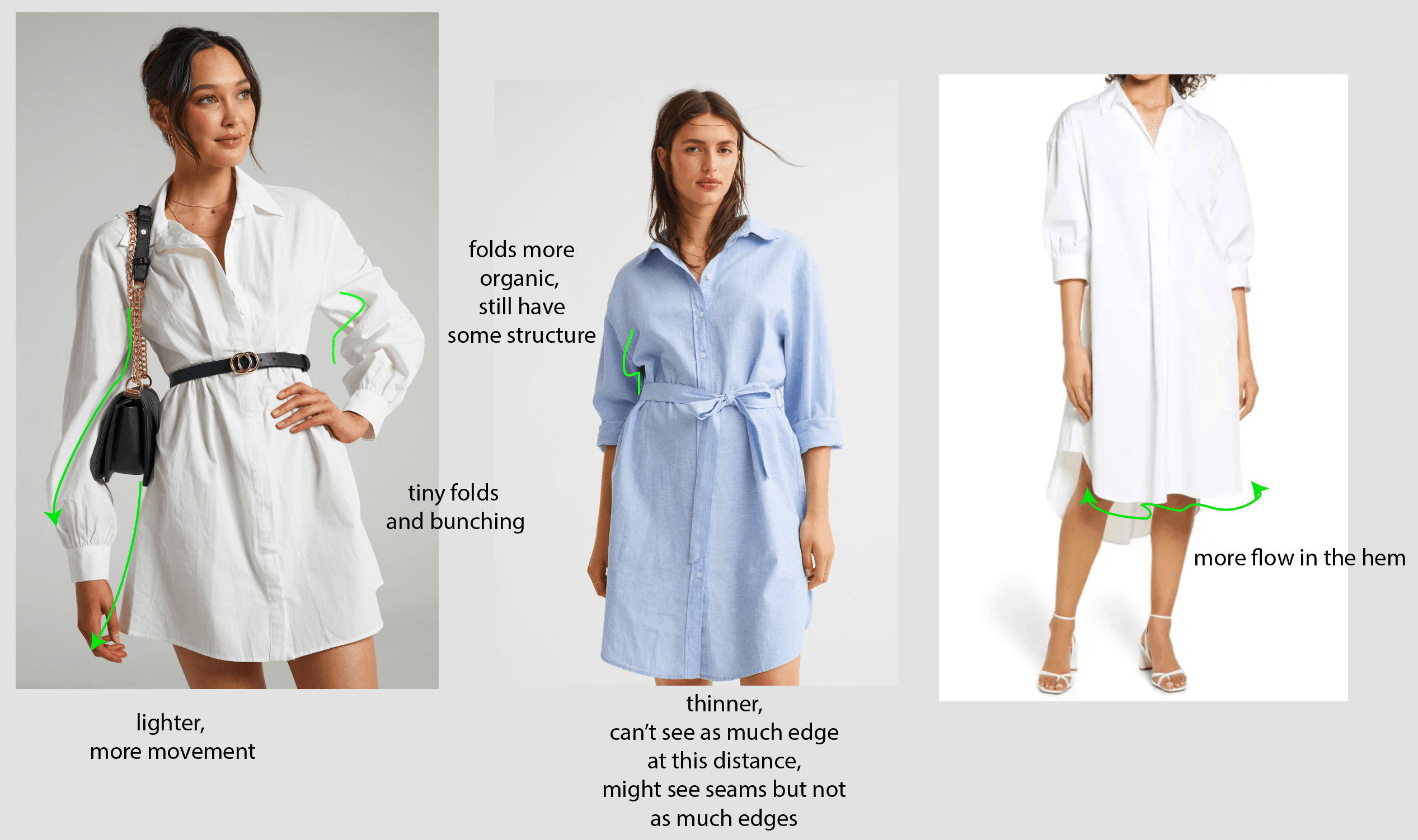
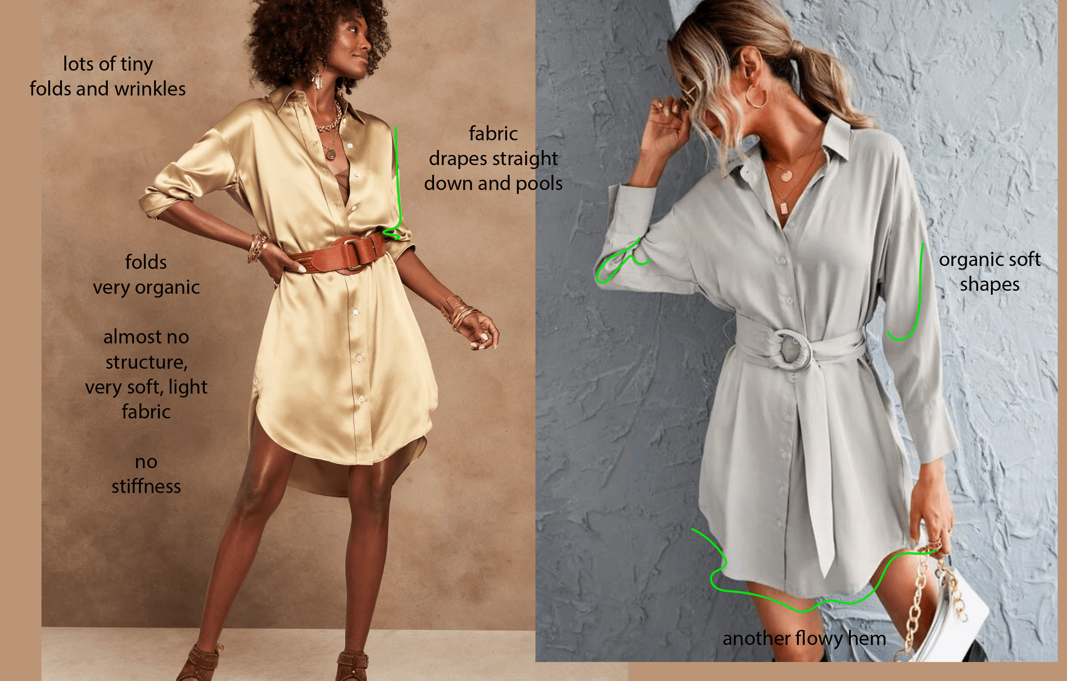
Material will also determine shape, weight, folds, and draping of fabric, so be aware of this while designing. References can help you learn how different material behaves: a stiff felt coat is different than a flowy, soft silk; plastic-y polyester different than cotton.
Take a look at the differences in these three materials: wool, cotton and silk.
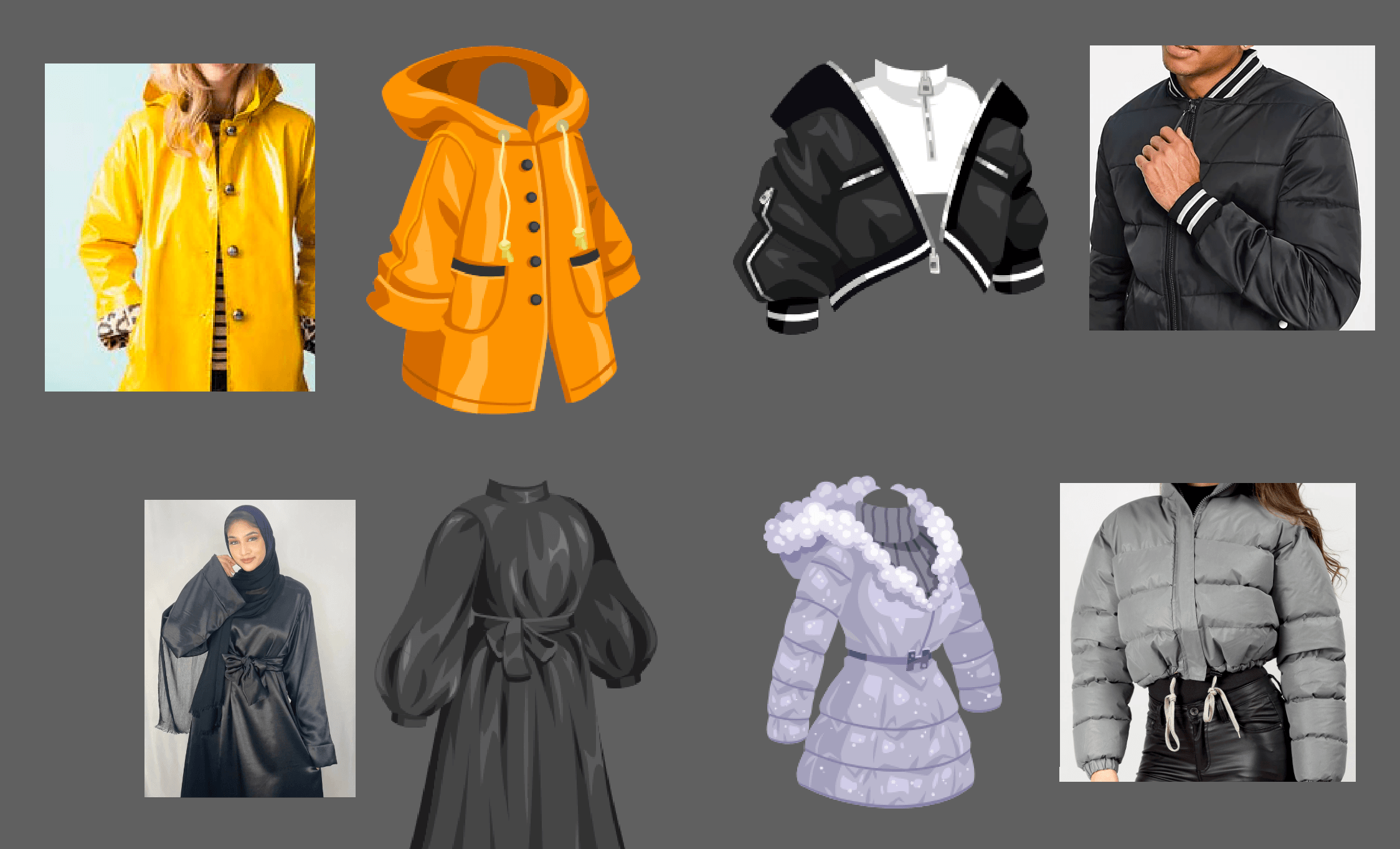
Wool:
Cotton:
Silk:
Taking a look at fashion illustration and clothed figure instructionals are a good resources for learning about fabric and the way it drapes and folds.
Study and Reference Gathering
You can find a lot of info and studies on material online. Most of it is not in our style though, so you will have to translate it!
Sometimes an easy tip to get a quick material study closer to our style is to Image Trace the image in Illustrator. If you’re about to start rendering a tricky material, give it a try on a reference image.
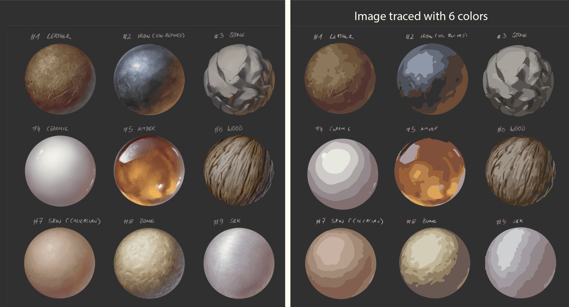
Just remember that we don’t go for full realism in our style. We use simplification and design elements.
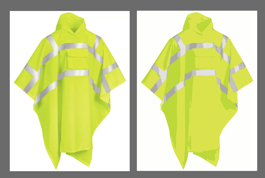
Further simplifying/designing some examples more toward our style:
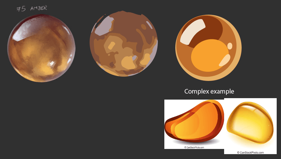
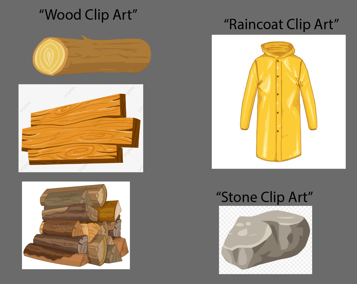
You can often find good references in our style by using the search term “clip art”. You can also try “vector” or “vector art” or “illustration”. You can see on the last example a few images from the internet that came up when searching for “Amber Clip Art:”
Additional examples of material
Fur
Fur, like a human’s hair, can have many different textures, lengths, volumes, and directions.
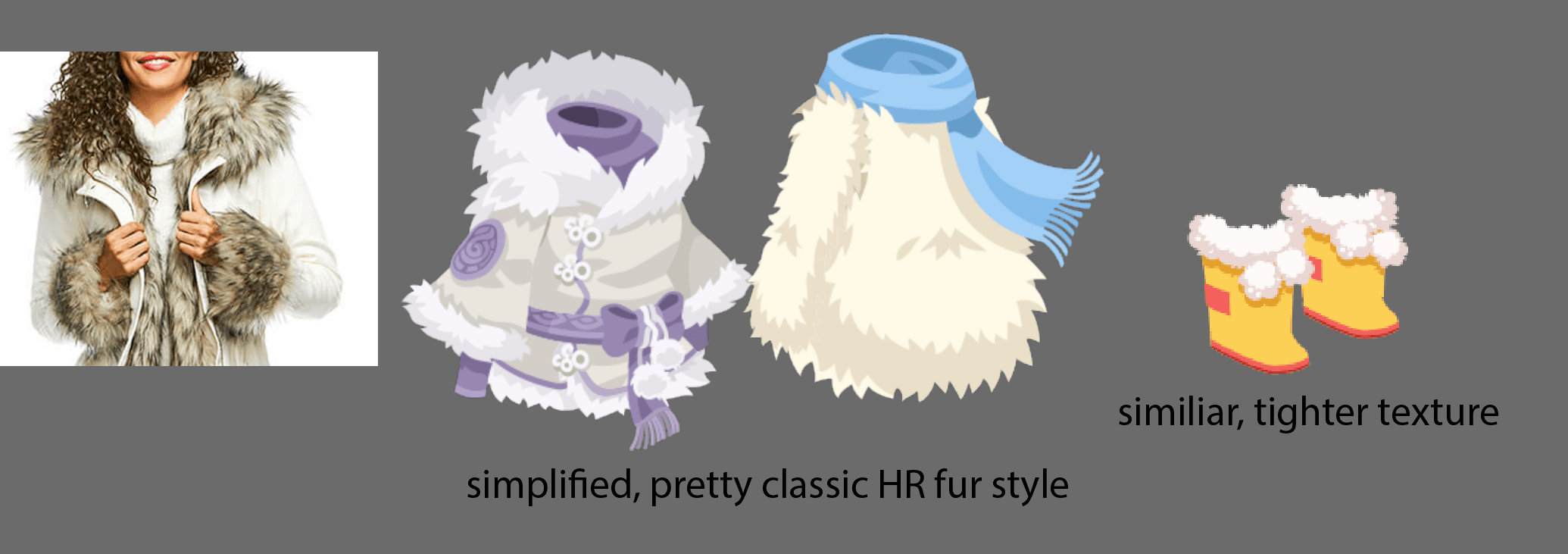
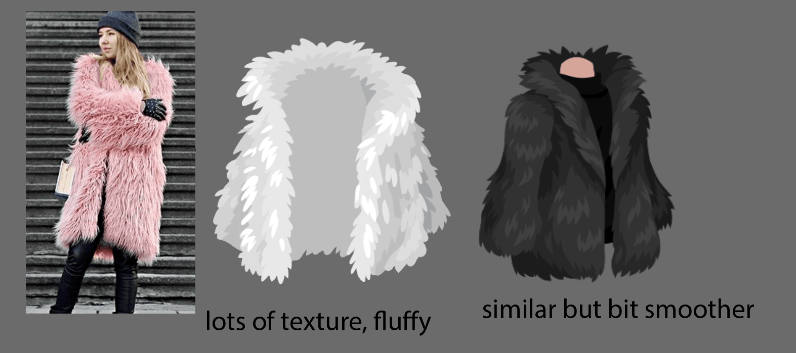
Some more examples of fuzz/fluff texture:
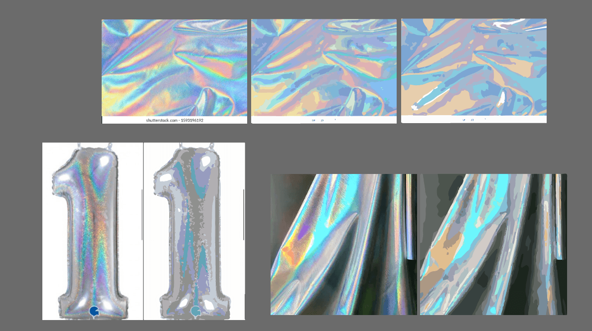
Holo/Iridescent
Holo/iridescent materials are quite popular and easy to style, given the colors and sparkles.
A defining characteristic of iridescent material is the hue shifting in light and shadows and high contrast.
Gold
IRL gold has lots of different hues and values.
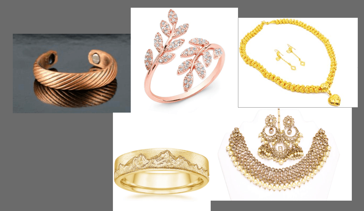
In Highrise, you may find a variety of different-looking golds as well.
(Note: not all examples here are the best examples to copy, but this shows what you may find out there!)
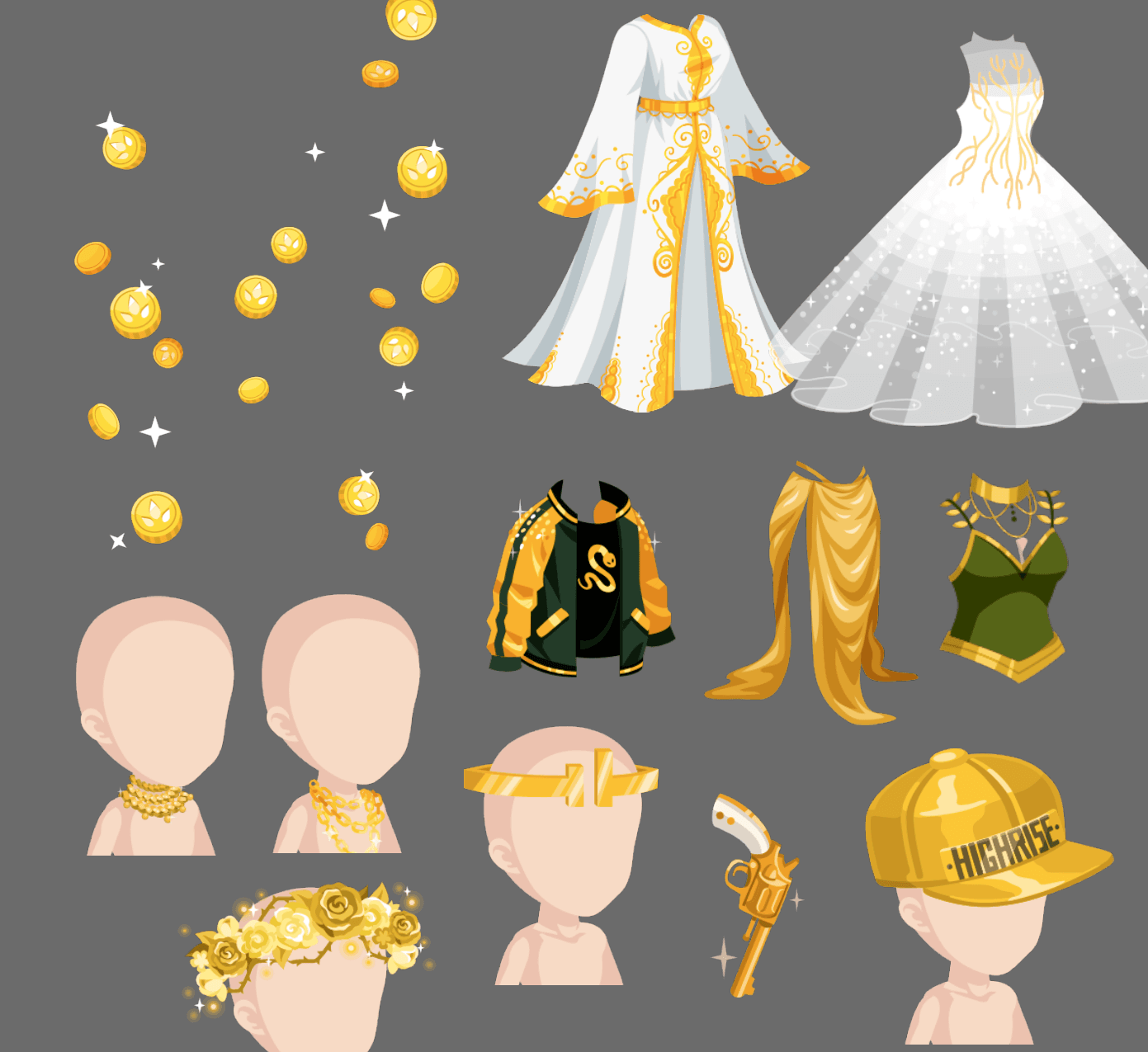
In various contexts, it makes sense to use a various colors or types of gold. For example, the gold coin in Highrise is our pretty classic, typical gold, but for an antique, old-looking gun, you may want to use a rustier, bronzier gold. For a delicate, light wedding gown, you may want to use a lighter, whiter gold. For a modern, trendy skirt, you may want to use something less saturated and more neutral. These are all good design choices.
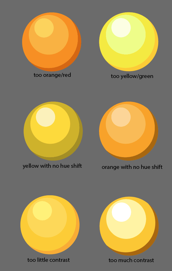
Here are some general tips for gold colors and values:
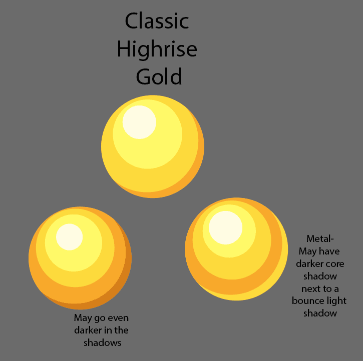
The classic HR gold works in many contexts and is basically the gold we use on the gold coin. It’s bright, saturated, has nice contrast. Gold is metallic so it will have darker shadows and a bright highlight. You may have a dark shadow next to a highlight or bounce light.There is distinct hue shift from a lemony yellow in the base highlights to a warmer yellow in the midtone, to orange in the shadows.
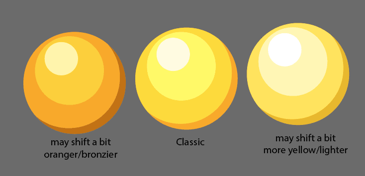
You may change the base hue a bit for different looks but sticking to a similar value range and hue shifting from light to dark is good practice
Avoid these common mistakes:
Some additional material examples: