Example Slider
Introduction
Sliders are interactive UI elements that allow users to select a value from a range of options. They are commonly used to adjust settings, control volume, or set preferences in a game.
In this guide, we will create a slider using UISlider, style it using USS, and handle interactions in Lua.
Creating a Slider
In this example, we define a slider using UISlider in UXML, apply styling in USS, and register interactions in Lua.
SliderExample.uxml
<?xml version="1.0" encoding="utf-8"?>
<UXML
    xmlns:xsi="http://www.w3.org/2001/XMLSchema-instance"
    xmlns="UnityEngine.UIElements"
    xmlns:hr="Highrise.UI"
    xmlns:editor="UnityEditor.UIElements"
    xsi:noNamespaceSchemaLocation="../../UIElementsSchema/UIElements.xsd"
>

  <hr:UILuaView class="slider-example">
    <VisualElement class="container">
      <hr:UISlider class="volume-slider" name="_volumeSlider"/>
      <Label class="volume-label" name="_volumeLabel" text="0%" />
    </VisualElement>
  </hr:UILuaView>

</UXML>
UILuaViewwraps the UI component.VisualElement(namedcontainer) contains the slider and label.UISlider(named_volumeSlider) is the slider element.Label(named_volumeLabel) displays the current value.
Styling the Slider
SliderExample.uss
.slider-example {
  display: flex;              /* Uses flexbox for layout */
  position: absolute;         /* Positions element absolutely within its parent */

  width: 100%;               /* Takes up full width of parent container */
  height: 100%;              /* Takes up full height of parent container */

  justify-content: center;   /* Centers children horizontally */
  align-items: center;       /* Centers children vertically */

  align-self: center;        /* Centers the entire element within its parent */
}

.container {
  display: flex;             /* Uses flexbox for layout */

  width: 400px;             /* Sets fixed width of 400 pixels */
  height: 100px;            /* Sets fixed height of 100 pixels */

  justify-content: center;  /* Centers children horizontally */
  align-items: center;      /* Centers children vertically */

  flex-direction: row;      /* Arranges children in a horizontal row */
  background-color: #333;   /* Sets dark gray background color */

  border-radius: 10px;      /* Rounds corners with 10px radius */
  padding: 10px;            /* Adds 10px internal spacing */

  font-size: 20px;          /* Sets text size to 20 pixels */
  color: white;             /* Sets text color to white */

  -unity-font-definition: var(--font-bold);  /* Uses predefined bold font variable */
}

.volume-slider {
  width: 100%;              /* Makes slider span full width of its container */
}

/* built-in classes */
.volume-slider .slider__foreground {
  background-color: white;  /* Overrides default slider fill color to white */
}

.volume-slider .slider__knob {
  border-color: white;      /* Overrides default slider knob border color to white */
}
.slider-examplestyles the main container..containerstyles the slider and label container..volume-sliderstyles the slider element..volume-slider .slider__foregroundand.volume-slider .slider__knoboverride default slider styles.
Handling Interactions
SliderExample.lua
--!Type(UI)
-- Declares this script is for a UI component

--!Bind
local _volumeSlider : UISlider = nil
-- Binds to a UI slider component that will control the volume

--!Bind
local _volumeLabel : Label = nil
-- Binds to a UI label component that will display the volume percentage

local MinVolume = 0
-- Defines the minimum volume value (0%)
local MaxVolume = 100
-- Defines the maximum volume value (100%)
local InitialVolume = 50
-- Sets the default starting volume (50%)

function Initialize()
  -- Sets up initial slider properties
  _volumeSlider.highValue = MaxVolume  -- Sets the slider's maximum value
  _volumeSlider.lowValue = MinVolume   -- Sets the slider's minimum value

  _volumeSlider.value = InitialVolume  -- Sets the slider's initial value
  _volumeLabel.text = InitialVolume .. "%"  -- Updates the label to show initial volume
end

function self:OnEnable()
  -- Called when the UI component is enabled
  Initialize()  -- Runs the initialization function
end

function self:Awake()
  -- Called when the object is first created
  _volumeSlider:RegisterCallback(IntChangeEvent, OnSliderChanged)  -- Registers a callback for slider value changes
end

function OnSliderChanged(event)
  -- Callback function triggered when slider value changes
  volume = _volumeSlider.value          -- Gets the current slider value
  _volumeLabel.text = volume .. "%"     -- Updates the label with the new volume percentage

  print("Slider volume changed to " .. tostring(volume))  -- Debug output to console
end
Initialize()sets up the initial slider properties.OnEnable()initializes the slider when the UI component is enabled.OnSliderChanged(event)updates the label and prints the new volume value when the slider changes.
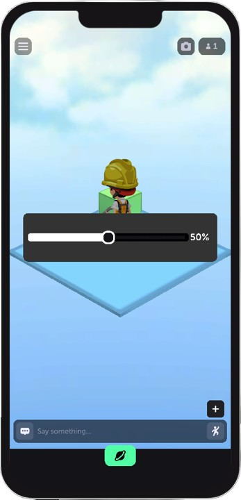
Visual Example
Conclusion
This guide covered:
- Creating a slider using
UISliderin UXML. - Styling the slider using USS.
- Handling slider interactions in Lua.
Now you can create and customize sliders for your Unity projects!

