Highrise Studio UI Documentation
User Interface (UI) Overview
Highrise Studio uses Unity Extensible Markup Language (UXML) files to define the user interface (UI) for your projects.
What is UXML?
UXML is a declarative markup language similar to HTML, but designed specifically for Unity. You use it to define the structure of your UI. Then, you style your UI using Unity Style Sheets (USS) and add functionality with Lua.
Creating a UI
- Go to the Project panel.
- Right-click and create a new folder for organization.
- Name the folder appropriately.
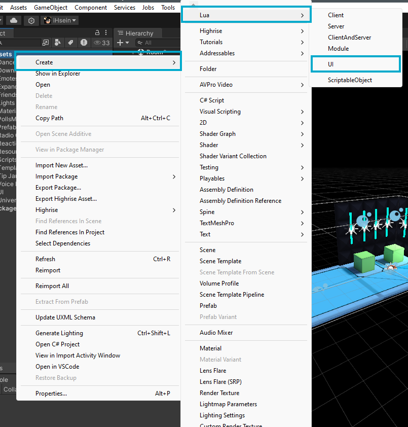
- Inside the folder, right-click and select Create.
- Choose Lua > UI.
- Give your UI a name using all lowercase letters to avoid issues with class names when styling.

Attaching UI to a GameObject
- UIs in Unity function like any GameObject, requiring a GameObject to be present in the scene.
- To add a UI to your scene:
- Go to the Hierarchy, right-click, and select Create Empty.
- Name this empty GameObject.
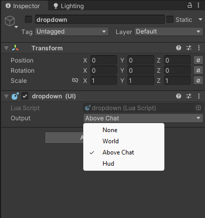
- Select the created GameObject, locate your UI file in the Project panel, and drag it onto the GameObject in the Inspector to attach it as a component.
UI Output Options
- None: The UI will not be displayed.
- World: The UI acts as a 3D world object, useful for elements like billboards, player names, or leaderboards.
- Above Chat: The UI moves with the chat window, ensuring it’s not hidden behind chat messages, useful for buttons and other interactive elements.
- HUD: The UI is overlaid on the screen and can appear anywhere, typically used for heads-up displays.

Overview of UXML, USS, and Lua
- UXML: Used to construct the UI, defining what elements are included, like player lists or other interface components.
- USS: Used for styling the UI, allowing you to customize fonts, images, and overall appearance.
- Lua: Handles functionality, like making buttons work or dynamically creating UXML elements based on game data.
Conclusion
Highrise Studio uses UXML to define the structure of your UI, USS to style it, and Lua to add functionality. By creating a UI, attaching it to a GameObject, and choosing the appropriate output option, you can create a visually appealing and interactive interface for your project.