Example Buttons
Introduction
Buttons are essential interactive elements used to trigger actions, submit forms, navigate, or perform custom functionality in a UI. They allow users to engage with your game and are a fundamental part of any interface.
In this guide, we will create a button using VisualElement, style it using USS, and handle interactions in Lua.
Creating a Button
In this example, we define a clickable button using VisualElement in UXML, apply styling in USS, and register interactions in Lua.
ButtonExample.uxml
<?xml version="1.0" encoding="utf-8"?>
<UXML
    xmlns:xsi="http://www.w3.org/2001/XMLSchema-instance"
    xmlns="UnityEngine.UIElements"
    xmlns:hr="Highrise.UI"
    xmlns:editor="UnityEditor.UIElements"
    xsi:noNamespaceSchemaLocation="../../../../UIElementsSchema/UIElements.xsd"
>

  <hr:UILuaView class="button-example">
    <VisualElement class="my-button" name="_MyButton">
      <Image />
    </VisualElement>
  </hr:UILuaView>

</UXML>
UILuaViewwraps the UI component.VisualElement(named_MyButton) acts as the button.Imageinside the button is styled using USS.
Styling the Button
ButtonExample.uss
.button-example {
  display: flex; /* Enables flexbox layout for flexible content arrangement */
  position: absolute; /* Positions the button relative to its nearest positioned ancestor */

  color: #CCCADA; /* Sets the text color to a light purple-gray shade */

  -unity-text-align: middle-center; /* Centers the text both vertically and horizontally */
  -unity-font-definition: var(--font-black); /* Applies a predefined bold font style */

  bottom: 0; /* Anchors the button to the bottom edge of its container */

  width: 100%; /* Makes the button span the full width of its parent element */
}

.my-button {
  display: flex; /* Creates a flex container for centered content alignment */
  position: absolute; /* Allows precise positioning within its parent element */

  align-items: center; /* Vertically centers the button's contents */
  justify-content: center; /* Horizontally centers the button's contents */

  width: 36px; /* Sets a fixed width for a square button shape */
  height: 36px; /* Sets a fixed height matching the width */

  bottom: 0; /* Positions the button at the bottom of its container */
  right: 14px; /* Offsets the button 14px from the right edge */

  transition-property: all; /* Applies smooth transitions to all changing properties */
  transition-duration: 0.2s; /* Sets transition animation duration to 200 milliseconds */

  background-color: #201F23; /* Defines a dark gray background color */
  border-radius: 8px; /* Rounds the button corners with an 8px radius */

  --unity-image-tint-color: rgba(0.937, 0.929, 1, 1); /* Sets image tint to a subtle purple-white */
}

.my-button:hover {
  background-color: #8561FF; /* Changes background to vibrant purple on mouse hover */
  --unity-image-tint-color: rgba(0.522, 0.380, 1, 1);/* Adjusts image tint to a deeper purple */
}

.my-button Image {
  width: 20px; /* Constrains image width within the button */
  height: 20px; /* Constrains image height to maintain aspect ratio */

  --unity-image: var(--image-icon-add); /* References a predefined add icon image */
}
.my-buttondefines a square button with a dark background..my-button:hoverchanges the background and image tint on hover.transitionmakes the hover effect smooth.
Handling Button Interactions
ButtonExample.lua
--!Type(UI)

--!Bind
local _MyButton : VisualElement = nil

-- Register a click event
_MyButton:RegisterPressCallback(function()
  print("Button Clicked")
end)

-- Register a long press event
_MyButton:RegisterLongPressCallback(function()
  print("Button Long Pressed")
end)
RegisterPressCallback()detects normal clicks.RegisterLongPressCallback()detects long presses.
Button Output
When the button is clicked, the following message appears in the console:
Button Clicked
When the button is long pressed:
Button Long Pressed
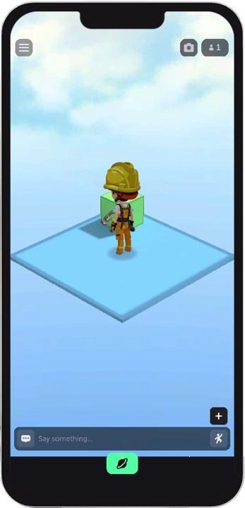
Visual Example
Conclusion
This guide covered:
- Creating a button using
VisualElement. - Styling the button with USS.
- Handling click and long press events in Lua.
With this knowledge, you can create buttons to trigger custom functionality in your game.

