Engagement
The Engagement section of the Analytics Dashboard helps you understand how players are interacting with your game.
Viewing Engagement Metrics
To view the Engagement metrics for your game, follow these steps:
- Navigate to the Creation Tab in the Creator Portal.
- Open the world you want to view analytics for.
- Navigate to the Analytics tab.
- Click the Engagement tab.
Engagement Metrics
The Engagement tab displays the following metrics:
- DAU (Daily Active Users): The number of unique players who have played your game in the last 24 hours.
- New Users: Number of DAUs who are first-time users.
- Average Session Time: Total play time divided by number of sessions on each day (hh:mm:ss)
- Total Playtime: Number of hours played over the selected time period (hh:mm:ss)
In this guide, we'll demonstrate how to interpret these metrics using sample data. The values and trends shown are for illustrative purposes only and may not reflect actual data.
DAU (Daily Active Users)
The DAU metric shows the number of unique players who have played your game in the last 24 hours. This metric helps you understand how many players are actively engaging with your game on a daily basis.
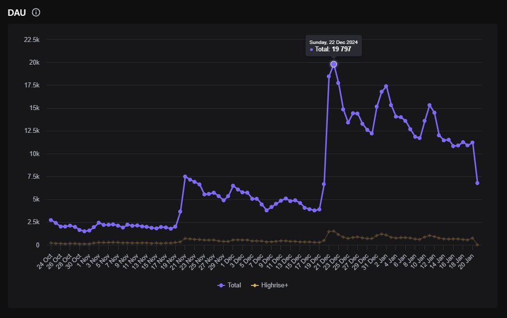
Total DAU (Purple Line)
The purple line represents the total number of daily active users of the app.
-
Significant Peaks: Notice significant spikes in DAU, particularly around December 22, where the total reaches nearly 20,000 users. Such peaks might be due to special events, promotions, or updates that temporarily attract more users.
-
Sharp Declines: The sudden drops following peaks might indicate the end of a promotion or event. For instance, the sharp decline after the peak around December 22 suggests that the surge in users was short-lived, possibly ending with the conclusion of an event.
Highrise+ DAU (Yellow Line):
The yellow line tracks the users who have the "Highrise+" subscription, offering special perks and engagement payouts.
- Consistent Trend: The Highrise+ line is relatively flat and stable, showing that the subscription base is steady, with slight increases or decreases but no drastic changes. This stability suggests subscriber loyalty and a consistent user base despite the total user fluctuation.
Dates (Horizontal Axis):
The dates along the bottom provide a timeline, from early October to the end of January. This allows creators to correlate changes in DAU with specific dates and potentially link them to external events or in-app changes.
User Count (Vertical Axis):
The numbers on the left vertical axis indicate the user count, helping to quantify the engagement. The graph scales up to 22.5k users, allowing for a clear view of user activity levels throughout the period.
New Users
The New Users metric shows the number of DAUs who are first-time users. This metric helps you understand how many new players are joining your game each day.
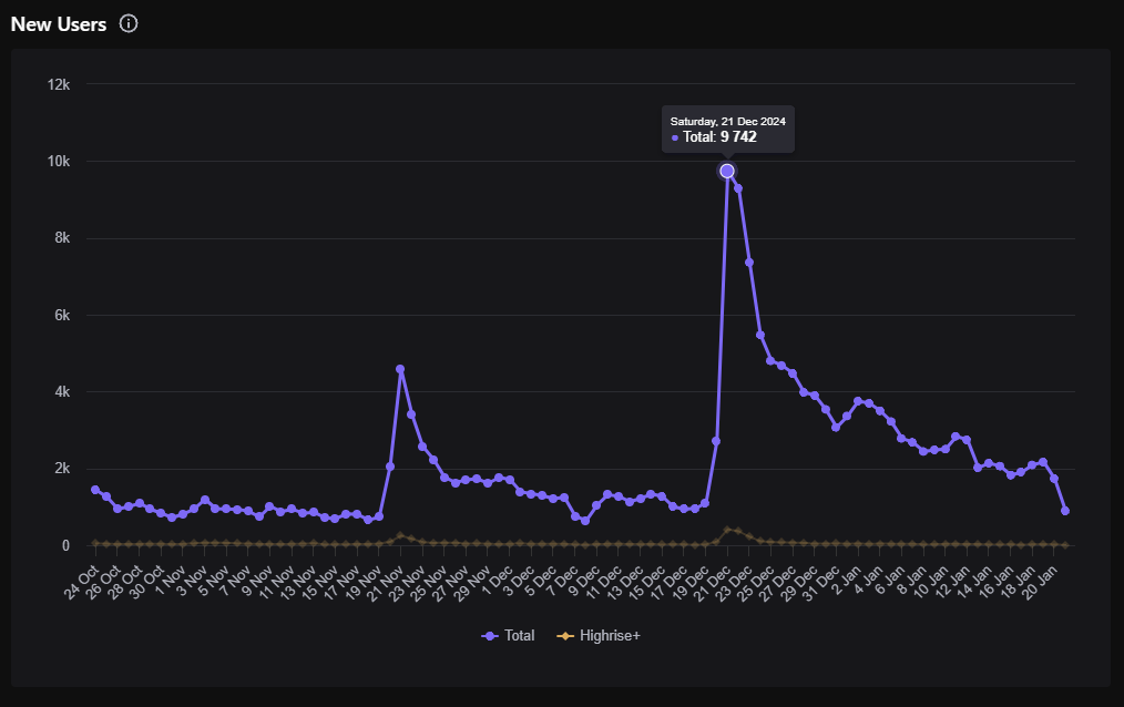
Total New Users (Purple Line)
The purple line shows the daily count of new users joining or opening the world for the first time.
-
Peak on December 21: The graph shows a significant spike in new users on December 21, where the total new users reach nearly 9,742. This peak could indicate a successful marketing campaign, a major app update, or a special event that attracted a large influx of new users.
-
Subsequent Decline: Following the peak, there is a sharp decline in new users, suggesting that the factor causing the surge was temporary or that the initial interest waned.
Analysis of Trends:
-
Gradual Decline Post-Peak: After the dramatic spike, the number of new users gradually declines, suggesting either diminished promotional activities or market saturation after an initial burst of interest.
-
Consistent Low Base Level: Prior to the spike, the number of new users is relatively consistent but low, suggesting stable but modest acquisition rates during that period.
Dates (Horizontal Axis):
The bottom axis marks the dates from early October to the end of January. This timeline is crucial for correlating the influx of new users with specific activities or external events.
User Count (Vertical Axis):
The vertical axis indicates the count of new users, scaling from 0 to 12k. This helps in quantifying the impact of different strategies or events on user acquisition.
Average Session Time
The Average Session Time metric shows the average playtime per session on each day. This metric helps you understand how long players are engaging with your game during each session.
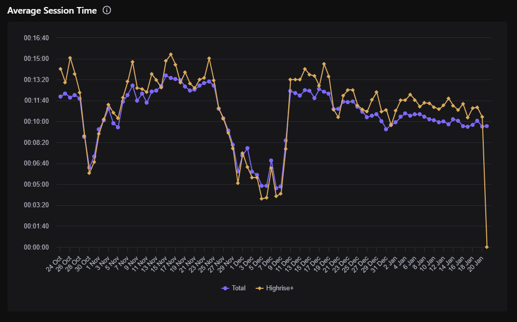
Understanding the Lines:
-
Purple Line (Total): This line shows the average session time for all users of the world, regardless of subscription status or other factors.
-
Yellow Line (Highrise+): This line represents the average session time for users who have subscribed to Highrise+, which offers special perks and engagement payouts for creators.
Key Trends and Observations:
-
Overall Trends: Both lines generally follow a similar pattern, suggesting that session times for Highrise+ users and the total user base typically move in tandem.
-
Notable Peaks and Valleys: Both lines show variability, with peaks indicating times when users engaged more with the app. The sharp decline at the end could be due to data truncation or a sudden drop in engagement.
-
Highrise+ Stability: The Highrise+ line tends to show less dramatic drops compared to the total user line, suggesting that subscribers might have more consistent engagement patterns.
Dates (Horizontal Axis):
The dates run along the bottom from early October to late January, providing a timeline for the session time data.
Session Time (Vertical Axis):
The left side of the graph marks the average session time, ranging from 00:00 minutes to over 16:40 minutes. This scale helps quantify how long users typically stay engaged with the app during each session.
Analyzing Drops in Session Time:
Any significant drop in session time might indicate issues that could be turning users away, such as app performance issues, lack of engaging content, or external factors. It's crucial for creators to investigate these drops and address potential causes to maintain user engagement and session length.
Total Playtime
The Total Playtime metric shows the total number of hours played over the selected time period. This metric helps you understand the overall engagement levels of your players.
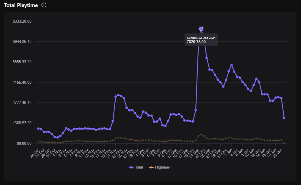
Understanding line trends:
-
Purple Line (Total): Represents the combined total playtime for all users of the app, showing how much time users are spending within the app collectively.
-
Yellow Line (Highrise+): Tracks the total playtime for users with the Highrise+ subscription, indicating the engagement levels of this specific user group.
Key Trends and Observations:
-
Significant Peak: There is a notable peak on December 22, where total playtime reaches around 7,820 hours. This could be attributed to a special event, an update release, or a promotion that successfully engaged users.
-
Fluctuations in Playtime: Following the peak, playtime gradually declines, indicating that the factors causing the spike were temporary.
Dates (Horizontal Axis):
The dates from early October to late January help correlate the total playtime with specific days, potentially identifying what events or updates influence user engagement.
Playtime Measurement (Vertical Axis):
The left axis indicates total playtime in hours and minutes, providing a quantification of how engaged users are on a day-to-day basis.
Analyzing Drops and Peaks:
Monitoring when significant changes in total playtime occur is crucial. For instance, the sharp decrease after December 22 may require examining what happened during this time to understand what may have caused the decrease in engagement.
Revenue Impact:
For Highrise+, since revenue is tied to engagement, understanding how playtime correlates with revenue generation is crucial. More time spent in-app generally means better chances for revenue, especially if monetization strategies such as in-app purchases or ads are effectively implemented.
Conclusion
The Engagement metrics provide valuable insights into how players are interacting with your game. By tracking key metrics such as DAU, New Users, Average Session Time, and Total Playtime, you can make informed decisions to improve your game and increase player engagement. Understanding these metrics can help you identify trends, optimize player experiences, and drive growth in your game.

