UXML Structure
Introduction
A well-structured UXML layout is crucial for creating maintainable, readable, and scalable UI components. By following best practices, you can ensure consistent padding, margins, and hierarchy, making your UI easier to modify and extend.
In this guide, we will cover:
- Building a clear UI hierarchy
- Organizing UI elements properly
- Ensuring consistent padding and margins
- Avoiding common structural mistakes
Best Practices for Structuring UXML
1. Maintain a Clear Hierarchy
A well-structured UI follows a logical hierarchy where containers group related elements together.
✅ Good Example (Proper Hierarchy)
<hr:UILuaView class="profile-ui">
    <!-- Header Section -->
    <VisualElement class="header">
        <Label class="title" text="User Profile" />
    </VisualElement>

    <!-- Close Button -->
    <VisualElement class="close-button" name="_closeButton">
        <Image />
    </VisualElement>

    <!-- Content Area -->
    <VisualElement class="container" picking-mode="Ignore">
        <VisualElement class="navigation">
            <VisualElement class="nav-button selected" name="_infoButton">
                <Label text="Info" />
            </VisualElement>
            <VisualElement class="nav-button" name="_settingsButton">
                <Label text="Settings" />
            </VisualElement>
        </VisualElement>

        <hr:UIScrollView class="content" name="_content" mode="Vertical">
            <VisualElement class="user-info">
                <hr:UIUserThumbnail class="profile-thumbnail" name="_profileThumbnail" online-indicator="False" />
                <Label class="username" name="_username" />
            </VisualElement>
        </hr:UIScrollView>
    </VisualElement>
</hr:UILuaView>
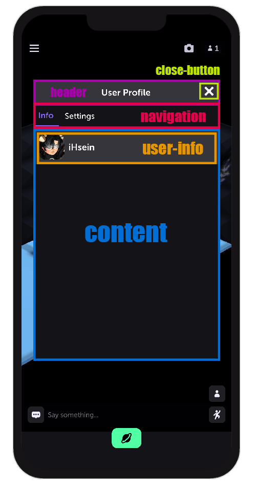
📌 Why is this a good structure?
- Containers (e.g.,
.header,.container,.user-info) help group related elements. - Scroll areas are inside a main container, making them easy to manage.
- Interactive elements (e.g., buttons) are properly named (
name="_settingsButton"), making them easy to reference.
2. Maintain Consistent Padding & Margins
Use USS (Unity Style Sheets) to define padding and margins globally instead of inline styles.
✅ Example of Good Styling
.container {
    padding: 10px;
    margin: 5px;
}

.header {
    padding: 8px 12px;
}

.nav-button {
    margin-right: 4px;
    padding: 6px 12px;
}
📌 Why is this important?
- Avoids inline styles in UXML, keeping UI clean and reusable.
- Consistent spacing ensures uniform layout across different screens.
3. Avoid Nesting Elements Unnecessarily
Too much nesting can make the UI structure hard to read and maintain.
❌ Bad Example (Too Deep Nesting)
<VisualElement>
    <VisualElement>
        <VisualElement>
            <VisualElement>
                <VisualElement>
                    <Label text="Too much nesting!" />
                </VisualElement>
            </VisualElement>
        </VisualElement>
    </VisualElement>
</VisualElement>
✅ Good Example (Flat and Organized)
<VisualElement class="container">
    <Label class="message" text="Well structured!" />
</VisualElement>
📌 If an element doesn't need a container, remove unnecessary wrappers.
4. Use Meaningful Names for Elements
Use descriptive class names and identifiers to improve maintainability.
✅ Good Naming
<VisualElement class="user-profile" name="_profileContainer">
    <Label class="username" text="Player Name" />
</VisualElement>
❌ Bad Naming
<VisualElement class="box1" name="container123">
    <Label class="txt" text="Player Name" />
</VisualElement>
📌 Why does this matter?
- Clear naming makes it easier to reference elements in Lua.
- Avoids confusion when modifying the UI later.
5. Ensure Elements Have Proper Width and Alignment
A common mistake is not defining width or alignment, which can cause layout inconsistencies.
✅ Good Example (Proper Width & Alignment)
.container {
    width: 100%;
    align-items: center;
    justify-content: center;
}
📌 Use
flex-directionin USS to control layout alignment.
Conclusion
Following these structure guidelines ensures that UXML layouts remain:
- Readable
- Maintainable
- Flexible for future changes
By maintaining a clean hierarchy, proper spacing, and clear naming conventions, your UI will be easier to develop and scale.

